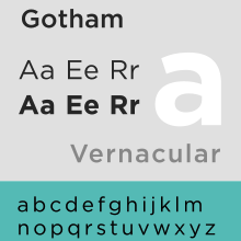
Gotham, a font designed by Tobias Frere-Jones in 2000, has gained a lot of exposure in recent years for it’s clean, modern look rivaling Helvetica.
It’s popping up just about everywhere these days.
In fact, in a few years, I imagine it will have the same status in the graphic design community that Helvetica holds: timeless, clean, and just plain awesome.
Check some great logos featuring Gotham below:


Do you think Gotham is worth the hype in the graphic design community?
Which do you like better — Gotham or Helvetica?
[via Gotham Logos on Tumblr]
Jordan Wiseman
I'm a student, graphic designer, and coffee addict. I currently am a multimedia artist at Lima Community Church in Lima, OH and get to work with the coolest people on the planet.


I like it, it has a softer and warmer feel to me than Helvetica, but I by no means have any problems with the mighty and powerful Helvetica. Helvetica remains, to me, the safest and most practical “go-to” font for many projects. The starting point or baseline to judge other designs from.
Agreed. Plus, the price tag is a bit of an ouch for your everyday kind of person.
Absolutely. If I owned Gotham, I would probably be using it more than Helvetica, but I just can’t justify dropping $300+ on a font.
No way will this be a Helvetica with it costing $69 or more. Though it is nice looking.
Definitely. I personally like it a bit better than Helvetica, but the price tag puts me off.
I really like this font. If it can be made more readily available (cheaper or free) I think it has potential. I’m not a huge helvetica fan, but gothum is sweet.
Agreed.
The name alone makes it awesome– but the price tag, not so awesome. I still like Helvetica better, and Helvetica Neue even betterer! 😀