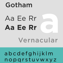
Gotham, a font designed by Tobias Frere-Jones in 2000, has gained a lot of exposure in recent years for it’s clean, modern look rivaling Helvetica.
It’s popping up just about everywhere these days.
In fact, in a few years, I imagine it will have the same status in the graphic design community that Helvetica holds: timeless, clean, and just plain awesome.
Check some great logos featuring Gotham below: