It’s been four months since I shared with you my thoughts on the future of ChurchMag since its acquisition at the beginning of the year, and I wanted to give you an update.
I had hoped more progress would have been made, thus far, but with some server hiccups early on (that lead us to WP Engine) and the launch of the new ChurchMag podcast, we just haven’t had enough bandwidth.
Now we do.
Timetables
I hate timetables.
They’re never very accurate and they can be cruel at times.
But we need them.
As my wife shared with me (Instant messaging me from across the room #geeklove):
“I was reminded of this while reading Bossypants by Tina Fey. She said this is something she learned from Lorne Michaels while working at Saturday Night Live. He said, ‘The show doesn’t go on because it’s ready; it goes on because it’s 11:30.’”
That being said, my timetable says: January 2014
First Things First
We are taking a similar approach that Shaun Groves is taking on his re-branding.
- Logo type and mark
- Design
After we have the logo type and mark ironed out, we’ll dig into the blog redesign.
(Yes, we will be using Standard 3)
Let It Begin!
As I said in my previous post, we would love to hear your feedback!
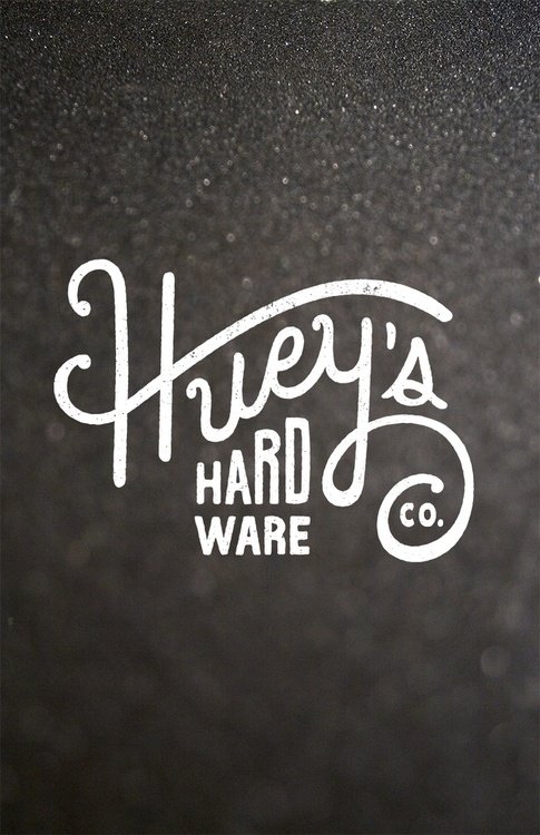
That being said, I had a few submissions and mock ups. Here’s what I’ve received:
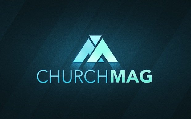
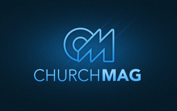
[Click for Larger]
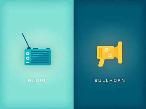
You can see how the icons flesh out with this example:
![]()
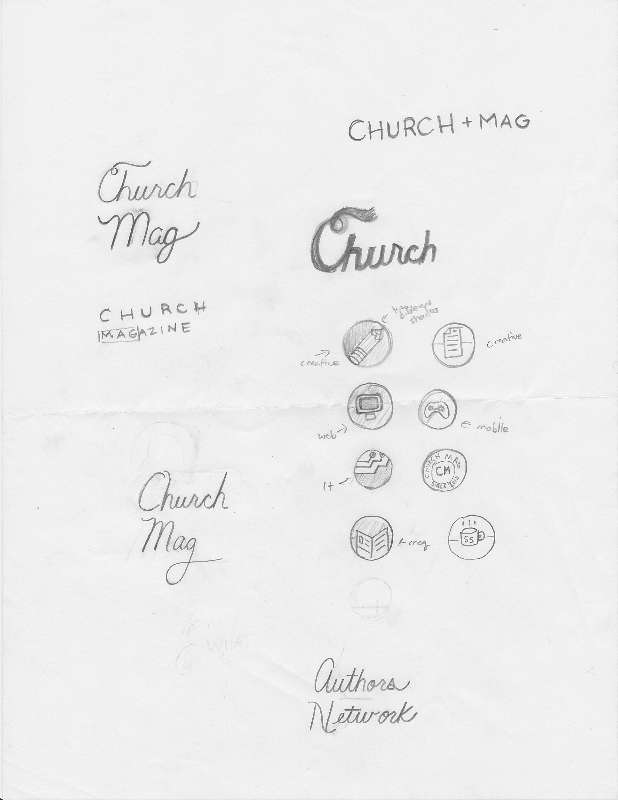
Marcus also shared with me his points of inspiration—which was really cool:


Without any kind of creative direction, these guys did great!
Inspiration & Direction
It’s funny how creativity has to ‘cook.’
After a few months, inspiration hit and I had a better idea of what ChurchMag 2.0 was going to look like.
Since I would like to share some of the creative process with you, I thought I would go ahead and show you what I’ve clipped for inspiration—much like what Marcus had done with his design.
Here goes…
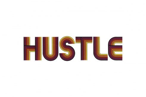
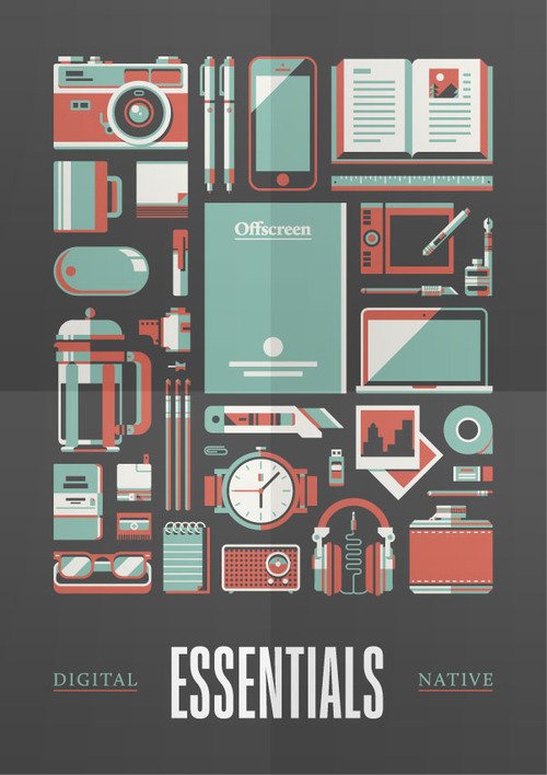
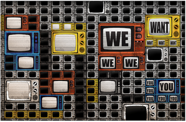
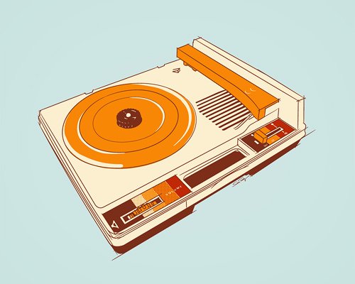
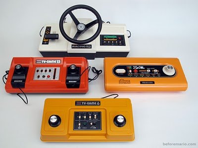
![]()

And some colors…
![]()
![]()
I know it’s not much, but it’s a start!
Now What?
We are moving forward and fleshing this out with a top notch designer; however, we’re not not locked in as of, yet. So, if you want to pitch us a mock-up, we would love to see it.
As for everyone else, enjoy watching this unfold and, please, feel free to give us some feedback in the comments below. If you would like to share your thoughts on other aspects of ChurchMag 2.0, go ahead and comment here.
😀
Eric Dye
Support Lead at Valet, and Proprietor of DYECASTING. Human by day, gamer at night, lover of coffee, and all things spicy.


Its so awesome to see some doodles that aren’t like amazing. I can’t draw worth a crap so its good to see you dont need to in order to have a great finished product!
Yeah. I would NEVER show my doodles—LOL!
I just double checked and standard 3.0 is a responsive design which will make me very happy on my mobile phone!
Also as a joke i’m going to say that your fonts aren’t thin enough :p http://www.networkworld.com/community/files/user7658/jony_ive_x_design_thinner.jpg
Also the ability to edit our comments would be very nice!
Hmmmm. I have–gasp–considered Disqus which may allow that…
Disqus! Disqus! Disqus! Disqus! Disqus! Disqus! Disqus! Disqus! Disqus! Disqus! Disqus! Disqus! Disqus! Disqus! Disqus! Disqus! Disqus! Disqus! Disqus! Disqus! Disqus! Disqus! Disqus! Disqus! Disqus! Disqus! Disqus! Disqus! Disqus! Disqus! Disqus! Disqus! Disqus! Disqus! Disqus! Disqus! Disqus! Disqus! Disqus! Disqus! Disqus! Disqus! Disqus! Disqus! Disqus!
Need I say more?
So you’re saying … ? … LOL!
I would second or third or 50th Disqus for commenting. It’s nice to be able to reply right from their site and so many other sites I use use disqus for comments so it would be nice for the familiar aspect of it for me.
The first logo is my first choice, to me the mark is bold and recognizable and would look awesome as a favicon or app icon on my quick links on my iphone.
LOL!
I love the new colors and clips you are gathering for inspiration… vintage, retro with a modern twist!
Thanks Randy!