2013 brought us many logo changes to some pretty big brands.
Among those brands, included American Airlines, VH1, TGI Fridays and many online brands.
Pictured below, are the before and after of 2013 online logo redesigns:
Bing
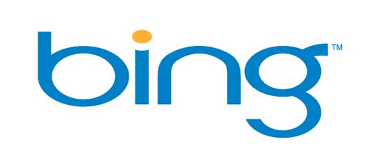

From blue to orange, Bing will need more than a color change to make a splash.


Goodbye bevel.
Yahoo!


Hello bevel.
Mail Chimp
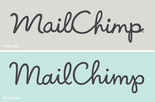
Subtle, isn’t it?
GitHub


I like what GitHub has done. Good stuff.


I didn’t even know they had made a change! Nice.
![]()

Just like Instagram, it’s subtle.
As minimal as many of these logos may have been before, 2013 brought a flatter and even simpler look.
I can promise you that you’ll be seeing similar branding changes coming to ChurchMag this year! 😀
What’s your favorite logo redesign from 2013?
Read more about these and other logo changes from 2013.
Eric Dye
Support Lead at Valet, and Proprietor of DYECASTING. Human by day, gamer at night, lover of coffee, and all things spicy.


I’m not gonna lie, I found the title to this article a little misleading.
When I saw “Biggest Logo Redesigns” I assumed biggest meant “most drastic” or “most significant”, as opposed to referring to the biggest *companies* that had done logo redesigns.
With the exception perhaps of Bing (the complete typeface change and the new angular b thing), none of these logo changes are big in significance.
I love ChurchMag, but I have to confess that this article was pretty disappointing.
Sorry to disappoint, man. Biggest did refer to the size of the companies, not the most drastic. I think what we can learn from these redesigns, is that redesigns don’t always have to be drastic. 🙂
Thanks for the reply!
It’s definitely still some interesting information, and it certainly is intriguing to see companies express something different even with subtle changes.
Hope you didn’t mind the critique too much – I think I was mostly disappointed because my expectations were so different from the actual content!
LOL! Didn’t mind AT ALL! In fact, I wish there was MORE candid feedback.
Thanks for being awesome. 😀