
If you are in the business of websites in any form, be it website design, WordPress application programming, or simply a blogger, you need to make sure that you are putting the best product out there possible. One big issue that web designers have ALL of the time is the issue of making sure your blog shows up the same on all browsers, on all platforms and on any screen size. The combinations seem endless and so you need to have the best tools with you to do the best you can.
It should be noted that you do NOT need a degree in design or web programming to simply test your site and note what is wrong. Church assistants or blogging moms need to assume that it is not being done and be proactive.
Here are three resources that you can use today to get out your site.
Browsershots
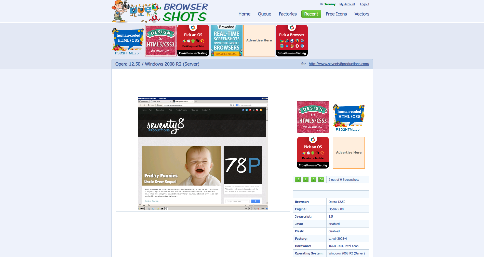
Pros: They test NEARLY EVERY desktop browser on four the four most popular operating systems. You can also custom design your screen size and for quicker screenshot results, you can go the paid route and have super fast results.
Cons: About one in every ten results fails and you have to retest. Also, this site is super popular so all free tests can take upwards of 60 minutes and if you do not extend your screenshots every 30 minutes, you have to restart. No mobile support.
StudioPress
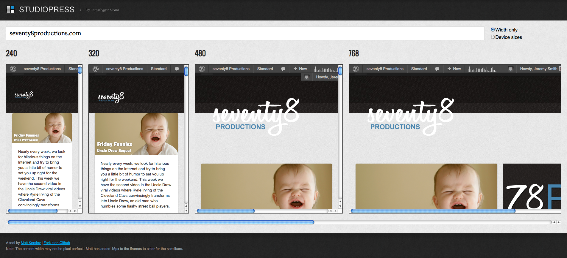
Pros: Super fast mobile screenshots perfect for those targeting mobile devices.
Cons: No desktop screenshot options or OS options.
Browshot
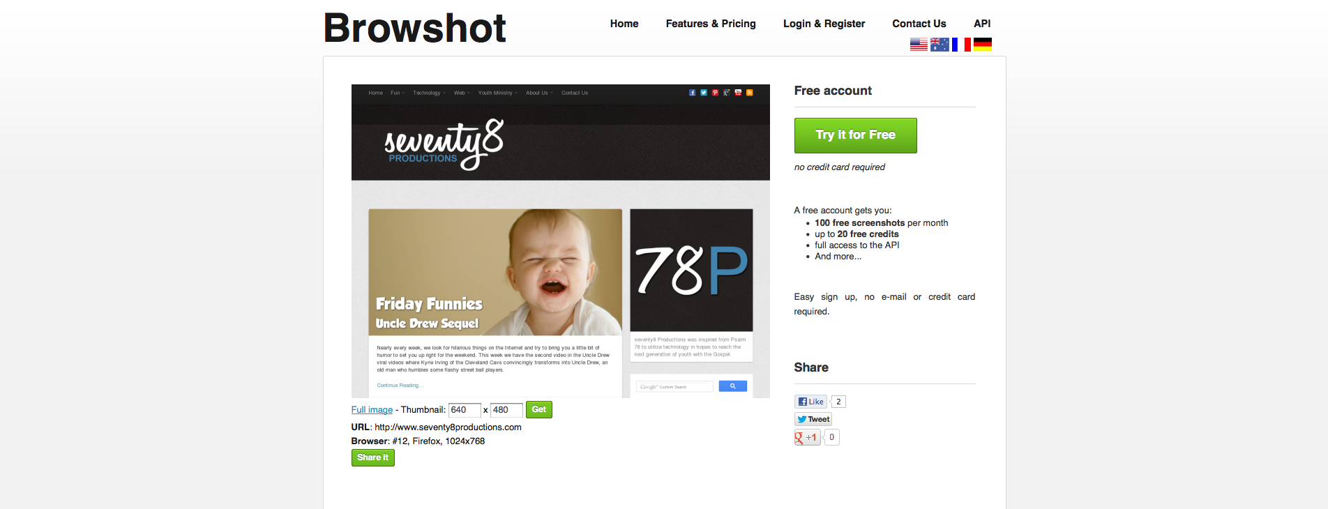
Pros: Allow you to resize screenshots
Cons: Limited number of screenshots a week. No mobile support.
What’s your favorite tool for testing browsers and responsiveness?
Jeremy Smith
Jeremy is owner of ChurchAndMentalHealth.com and the Co-Occurring Program Coordinator and a Licensed Professional Clinical Counselor at a community mental health center. Jeremy has a history of working as a ministry director for Youth for Christ for 8 years and then working as a mental health and substance use adult counselor in Colorado and Ohio, specifically running an Opioid Residential Treatment Center.


I use browserstack.com. Great tool and resource. You can even setup local portals in case you develop for an intranet or secure site.
I use a Chrome plug-in called “Resize Window” for initial testing. I’ve used some of the others, but it’s good to be able to quickly get an idea of what it would look like in other resolutions.
Paul