
This isn’t just about looks, folks, this is pure power!
You have to see these other pictures and find out exactly how extreme this thing really is!
This isn’t just about looks, folks, this is pure power!
You have to see these other pictures and find out exactly how extreme this thing really is!
I didn’t know a WordPress ‘functions.php’ file could get tired, did you?
What I did know, is that it’s usually better to code changes to WordPress oppose to over using and relying on Plugins to do all your lifting. One place that a lot of code changes and modifications goes is in the ‘functions.php’ of your theme file. After reading a great article on How to create your own WordPress functionality plugin, there’s an even a better way to go about making changes.
With the rise of Social Networking and smartphone use, finding ways to exploit it for marketing purposes have become more and more creative, as it isn’t a simple thing to get your hands around.
I’ve heard of Twitter and Facebook parties, which basically works like your typical Avon, Tupperware, or Pampered Chef party, but everyone attending keeps their smartphones ready to blast Facebook and Twitter feeds.
Annoying.
Other marketing campaigns are far more advanced than that, they usually involve down loading an app that eventually ends up being forgotten or deleted.
Burger King, however, may have finally came-up with a great way to integrate this by rewarding their users in a easy and useful way:
Be sure to upgrade your WordPress install!
WordPress 3.1.3 is now available, and as usual, includes security updates and enhancements. Also, WordPress 3.2 Beta 2 is ready, and it looks like some of the enhancements and changes to WordPress.com will be making its way to self-hosted WordPress.org users.
Awesome.
Here’s what comes with the WordPress 3.1.3 update:

Jam pack every nook and cranny with something.
The web design term is called “white space” and is the space between different elements on a page. This area does not have to be empty of color or patterns, but what is absent is clutter and content. For experienced web designers (and many different artists), white space is a highly coveted resource that they tend to battle against clients to fill. In fact, a whole design genre, called Minimalism, has emerged in the web design world. Websites like Google and Apple do this SO WELL!
White space allows for easier scanning of a website, getting to the content that the user wants quicker. The focus becomes less on distractions and more on the product (ministry, blog, or your organization) and reduces user frustration. These kind of designs always come out clean, professional looking, and refreshing feel to it.
Design it to your liking.
While you may love the color red and want to start up a church website that has red as its primary color, you need to make sure you know what you are trying to convey in these colors. The thoughts and emotions that correspond with red are anger, aggression, and is clinically proven to raise blood pressure. Even Target.com, whose logo is based on the color, shy’s away from over using it because of how it could be interpreted.
At the same time, structure is important and you should always keep your audience in mind. Bloggers might want to share their top posts to those that first visit your website, but without focusing on new articles, your traffic will get lost. For those that love to make things visually appealing may want to make their website a Flash site, but many people do not have Flash installed on their site and these files are large and take time to download. Be cautious with what you use and always get a client’s opinion of what they see.
Publish it after you see it works on YOUR browser.
Several times I have created a website for someone, been able to get it exactly how they want it to look and then they expect it to go live the next day. The problem with this is that the website on my Firefox 4 browser on my 17 inch MacBook will look differently than my grandma’s 21 inch PC that only runs Internet Explorer 6. (Oh, how I loath IE6!) As web designers, you need to make sure that your site comes up correctly on all major browsers at all major resolutions, and with all the different operating systems.
Feel overwhelmed? No need to fear. BrowserShots.org is a great online resource to do all of this (and more than you probably needed). I use this every time I make a website to make sure it is working on all systems. Of course I will still try it out on different browsers myself, but this is the first line of corrections when I come up with a new design.
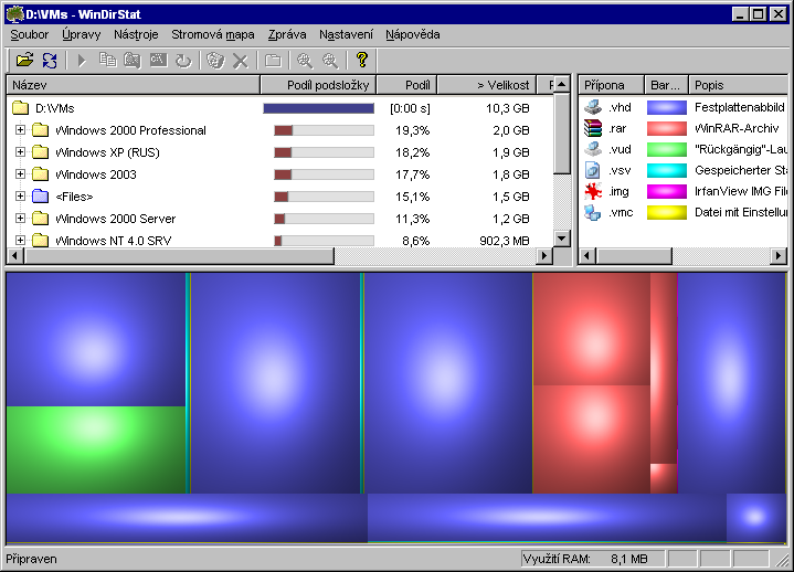
Last week we covered a utility app for the Mac called, DaisyDisk. What made DaisyDisk so unique, was the fact that it gave you a visual and spatial representation of how disk space is being used on your system. It had several other nice features, too, but the visual representation is what really set it apart.
So, what if you would like to visualize how your disk space is being used if you’re running Windows?