Most church websites have a page where you can watch or listen to previous messages. If yours doesn’t, then I challenge you to make it happen but that is a whole ‘nother day.
I created our church website and it has one, you can check it out here.
But as I was getting ready to listen to some of my favorite podcasts, I decided to start saving some hard drive space and start watching and listening via my browser. And so I went to Church of the Highlands to listen to a message from Pastor Chris Hodges (whom I call my iPod Pastor).
Their message page is absolutely outstanding. As in, I felt like their design guy just kicked my butt. (David Russell is listed as the webmaster and my hat goes off to him).
And here is why:

1. Clean Design
It’s not cluttered although there is a lot of information. That is a tough combination to pull off but they did it with ease.
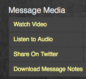
2. The Goods
I was there to hear a message and they put the goods front and center. You can stream the video or the audio as well as download the video or the audio. And all of those links and information are on the same page. If I could liken their page to a furniture store, I would say it is so Ikea.
3. The Details
They have included the name of the series, the information on the selected message (which part of the series it is) and included the date of the selected message. These are things that seem obvious until you check your own church website. If these aren’t included, then it is going to be confusing for people that access your website before the attend in person.
4. The Extra Features
They are so 2.0. They have social media sharing links and I still can’t get over that all of this is on the same page. Also available are downloadable message notes, which seems to bridge the gap from pixels to flesh. This one caught me by surprise; they have a comments page. Although it may not be your cup of tea (or your Lead Pastor’s), I think it certainly enhances the interactivity factor.
You can also give online and I love that their link is non-obtrusive. It is simple and understated, which speaks volumes to me.
Other messages in the series as well as the previous message are accessible via text links.
What did you notice about their design? What do you consider “must-haves” on a message page?
Eric Dye
Support Lead at Valet, and Proprietor of DYECASTING. Human by day, gamer at night, lover of coffee, and all things spicy.


I think you did an article about Media Fusion (http://www.startthefusion.com/) That’s what I use for my churches video teaching archives. http://warehouse727.com/resources/archives
YAY, I think I’ve covered all of those in desiging my church’s podcasting/messages pages:
http://friendshipcommunitychurch.org/podcast
We are running on Drupal and I have actually written a detailed HOW-TO guide for how we produce our weekly podcast. And you can read it right here: http://friendshipcommunitychurch.org/tutorials/podcast-production-how-to
Feel free to twitter or email me if you have any questions!
Blaine, thanks so much for the kind write-up on our message page. It’s one of the most used features of our site and so we invested a lot of energy into the design. You highlighted all of the things we felt were important and tried to define with a properly balanced emphasis of the primary goals.
The interactive side of this page is really an initial foray for us into more user-driven content. This was a neat way for us to engage site visitors more and feel out the opportunity to make the site more interactive. In our next iteration, I hope to have more conversational features.
P.S. I love IKEA. 🙂