• Skip to main content
  • Skip to primary sidebar
  • Skip to footer
  • Web
  • Creative
  • Mobile
  • IT
  • Code
  • CMS
  • Podcast
  • Memes
  • Resources
  • Newsletter
  • About

ChurchMag

The #1 Resource for Church Technology Creativity & New Thinking

Web Hosting

ChurchMag / Creative / The “Above the Fold” Fallacy

The “Above the Fold” Fallacy

The “Above the Fold” Fallacy

July 17, 2012
by Eric Dye

Are you designing websites for the fold?

Although there may be some important elements to have at the head of the page versus the bottom, the general concept of “designing for the fold” has rapidly become antiqued.
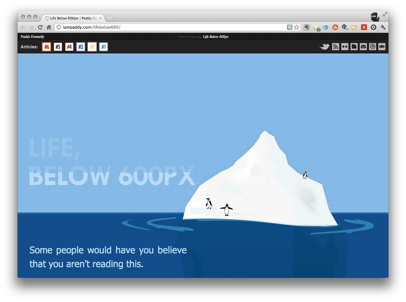
Life, Below 600px

Life, Below 600px takes an intriguing look at this aged design trend and not only challenges it, but calls it “wrong, wrong, wrong.”

But, Life, Below 600px isn’t just blowing steam. They’ve used an excellent case example to exhibit their point — 37 signals website.

I encourage you to give Life, Below 600px a read. It may change or re-align your thinking about the age old fold.

After you read it, tell me what you think!

Eric Dye

Support Lead at Valet, and Proprietor of DYECASTING. Human by day, gamer at night, lover of coffee, and all things spicy.

Category: Creative, Design, Web

Level up your inbox.

Free resources, top posts, and more!

Reader Interactions

There are 7 comments already... Come join us!

  1. Bryan Chalker says

    July 17, 2012

    Struggled with almost every client I’ve had. It’s always interesting to be talking to someone about the fold, and as they are giving the argument that no one will see “what lies below”, I open my laptop (with a higher resolution), to show it not being an issue. A website is meant to be explored – deeply, in some cases. Nice case use with 37Signals.

    Reply
    • Eric Dye says

      July 18, 2012

      Agreed. The dynamics are really changing, especially when you consider mobile devices.

      Reply
    • James Cooper says

      July 18, 2012

      If a client says that to me, I ask if they use Facebook (they normally do), then I ask if they scroll to read things (they normally do) – point made!

      Reply
  2. Ryan says

    July 17, 2012

    I guess this depends on the audience, and what you’re trying to accomplish with the site. For landing pages, it is crucial to have the opt-in “above the fold.” I work with this daily, and manage traffic in the hundreds of thousands of hits per day. Above the fold is still alive and well.

    Reply
  3. Justin says

    July 18, 2012

    I think there’s two parts of this that are really important to point out:

    1. The most important stuff still needs to be above the fold.
    2. You need something that hints at or shows that there’s content below the fold to explore.

    Reply

Trackbacks

  1. Website Layout: Where to Put the Important Stuff [Infographic] | ChurchMag says:
    October 24, 2013 at 13:30 PM

    […] I’ve found that the “Above the Fold” is no longer applicable. […]

    Reply
  2. Website Eye Tracking 101 [Infographic] - ChurchMag says:
    September 10, 2014 at 12:00 PM

    […] a website that needs to go into a great website. Content needs to be above the fold (or is that a fallacy?), images need to be compelling, the font needs to be readable, it needs to translate well to all […]

    Reply

Speak your mind... Cancel reply

Your email address will not be published. Required fields are marked *

Primary Sidebar


‹ Previous

Evolution of the Internet: What Was Your First Online Memory?

Next ›

How-To Build a LEGO Candy Machine [Video]

Footer

Web Hosting

About

About
Contact
Advertise
Write for Us!
ChurchMag Minecraft Server

We #HEART

Powered by

Member of the ChurchMag Family

ChurchMag Podcast

Tired of Video Conference Calls

Are You Tired of Video Conference Calls? [Podcast #321]

Pick your favorite ways to connect.

Comment Policy / Privacy Policy / Archive / Log in

© 2021 ChurchMag