
It seems like every social media is incorporating a redesign in the last few months, including Facebook, Google Reader, Google Mail, YouTube, and now Twitter. This latest of redesigns includes not only desktop browser changes, but a new mobile app.
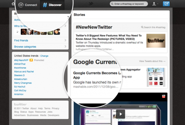
One of the biggest non-CSS changes is the addition of a section called Discover. This section has essentially taken it’s trends, personalized them, and given them more of a prominence on the website and apps. At the same time, they have combined all interactions with mentions from others into a single list of Connect. In the same section is the Activity tab that allows you to see what your friends are favoriting and retweeting.
List of Changes
- Structure Has Flip-Flopped. They have moved the content to the right and the account information to the left. Maybe this was to conform to Facebook and Google+, but even if not, it was a good and logical move.
- Individual Tweets Have Their Own Content. In a move that seems to defy Twitter’s original intent of being a simple messaging service, each tweet can now be ‘opened’ to show what it was replied to and even how many times it was retweeted. Not long before we will see a complicated analytic service?
- Fully Utilizing HTML5. This means that everything was built from the ground up and the integration of the mobile apps work better than ever.
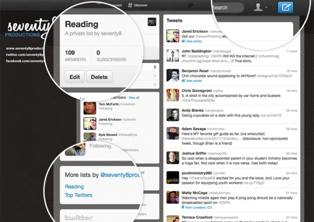
- A Focus on Full Names and Not Twitter Handles. When you load the page, you will find that the names of all of the Twitter users are now shown, instead of their unique and many times unreadable Twitter handles. Makes everything that much more personal and relational.
- Incorporation of Brand Pages. To keep up with Facebook and Google+, Twitter has added Twitter pages. One of the better and simpler ones is Best Buy‘s that has promotionals and marketing written all over it. Unfortunately, right now brand pages are only available to a small selection of brands and partners.
- Strong Focus on Photos and Videos. Before, Twitter would simply link to photos and videos and you would have to go to third-party sites. They began to improve that a while ago with the addition of Twitter pictures and now we see the reason for that, especially in the desktop browser.
- The Width of the Content Area is Small. This means that the creativity of the Twitter backgrounds can start to shine through. Hopefully we will see inspiration shining through soon.
- New Search Bar and Create A Tweet Button. While it may be insignificant, the new button to write a tweet has switched from a pen to a quill.
What do you think of the new Twitter look?
Jeremy Smith
Jeremy is owner of ChurchAndMentalHealth.com and the Co-Occurring Program Coordinator and a Licensed Professional Clinical Counselor at a community mental health center. Jeremy has a history of working as a ministry director for Youth for Christ for 8 years and then working as a mental health and substance use adult counselor in Colorado and Ohio, specifically running an Opioid Residential Treatment Center.


I’ve never been one to complain about changes to Facebook or Twitter and I’m not going to start. I love the new format on the web with ONE exception. There needs to be an option to easily quote a tweet instead of being forced to do a simple RT (is there a setting I’m missing somewhere?).
I like the iPhone app as well, but I’m curious why they have the margins on the sides and navigating to DM’s takes one too many “clicks”.
Otherwise I think they did a great job. Twitter is still my favorite social media channel.
I agree about quoting tweets and only will do that in Tweetdeck (the old version). As for the app, Twitter has yet to get it right, I am just glad that the tools and browser are not crap anymore.
KC, swipe up on the profile icon in the twitter app for iphone to get directly to DMs Also, swipe left on the profile icon to switch accounts. Just a helpful time saving hint.
Thank you! The swipe left worked, but the swipe right didn’t. I was looking more for a button next to @Connection or w/in the same window as interactions.
My problems are with the mobile app. I use and monitor multiple twitter accounts, and it’s cumbersome to switch accounts. It’s also not as simple as I’d like to get to the tweets by my lists – I, like most people on Twitter, I’d guess, – have a select few people whose tweets I never want to miss. But Twitter seems more interested lately in making sure I can see tweets by advertisers and other “sponsored” folks.
Agreed. I don’t know if there will ever be a perfect mobile solution. Most of my viewing of lists happens with the Tweetdeck app.
I honestly HATE IT! I don’t see why they have to go changing stuff. It’s pointless. Twitter was perfect the way it was!
Change is necessary, but some of the things do not seem to have a valid enough reason. We’ll see if people hate it too much…