
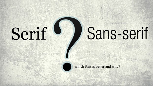
Two types of fonts have long been in contention with each other: Serif and Sans-Serif. You see them all over the place, and for some reason, in this day and age, the san-serif font is becoming more and more common.
So why is this? What makes the sans-serif font better than the serif font? Or is the sans-serif font better?
Here are some of my thoughts…
The Benefits of Serif
For the most part, the serif font dominated the book realm for the majority of its history. Ten years ago, if you picked up a book off the shelf and began to read it, your eyes would probably not have noticed the fact that the font was a serif font; but it was and most were.
The reason for this is largely due to the fact that, for whatever reason, serif fonts are incredibly easier to read over sans-serif fonts. I’ve tried and tried to come to some sort of conclusion as to why this is, but really I just have to be content for now that it is what it is.
Therefore, the largest benefit to this font is its readability.
Likewise, the look and feel of a sans-serif font is useful to designers and to those who see it; the font gives a certain weight to academics and study. Bookstores love using the font in their logos because it speaks for itself.
There is a considerable amount of elitism that is carried with the sans-serif font.
The Benefits of Sans-Serif
The Sans-Serif font probably got its first, major boost in common use with the advent of Helvetica. Beforehand, at least to my knowledge, the sans-serif font wasn’t widely used.
Since Helvetica’s take-over of virtually all modern design, the sans-serif font has begun to creep into other spheres of typography. Where books used to be solely committed to printing serif fonts, you now see modern books using sans-serif in their print.
Blogs also use sans-serif fonts about as much as (if not more than) serif fonts…like your very own ChurchMag!
The reason may very well be due to the growth in popularity of what may be referred to as ‘minimal design’. Another term that’s loosely thrown about would be simplistic appeal.
Sans-serif fonts very beautifully accent this type of design, but in many cases the reason behind the use of a sans-serif font is deeper than aesthetics. Using sans-serif as your font choice will automatically designate your blog/book as being sophisticated, futuristic, and modern.
It may be said that serif fonts generate an academic environment in which to read, while sans-serif fonts typically produce a ‘techy’, or like I said before, sophisticated, feel in their look.
The benefit of using such a font is quite obviously seen in that it is simple and generally easy to read (though not as easy as serif). But for the most part, I believe the sans-serif font to be far more beneficial in an aesthetic sense in the context of design, rather than in the use for reading; which brings me to my final point…
Serif or Sans-Serif?
This question isn’t really solvable.
Each font has its uses, as may be obvious to you. However, what I will say is that the increasing use of sans-serif fonts in the use of reading (such as blogs, books, and other mediums, particularly that of e-books) is detrimental to the reader.
The fact that serif fonts are undoubtedly easier to read is enough to say that it should be the primary font choice in any setting that requires lengthy reading. Of course, I know that this entire post is in a sans-serif font, but hey, what can I do? At least now, you all know my opinion on the matter!
Either way, however, it should be noted that sans-serif definitely can be used in the context of reading, but it should be carefully thought out, and it should enhance the readers experience. Generally, if you’re writing long posts, or a book, using a serif font (I promise) is going to be a better reading experience over a sans-serif font.
As far as design goes, though, using a sans-serif font is generally better. In a lot of cases, this is because our type of design now-a-days is labeled as modern, simplistic, minimal, and so forth. Therefore, using the sans-serif font makes sense and I encourage it.
What about you guys? I’ve made my stance clear, but there are plenty of people who disagree with me (that’s okay!). Share some of your thoughts below!
Calvin Koepke
Software engineer at StudioPress. JavaScript, React, WordPress, and more. Writing about web development at my blog. Lost and found.


Good post good post man. (that wasn’t a typo btw)
I’d have to rock sans serif if I had to pick. Blame it on the designer in me
Oh hey, in design I have no problem! More power to ya 🙂
Vote for Sans Serif 🙂
Unbelievable! 🙂
I’ve read several sources that claim that sans-serif fonts are actually easier to read that serif fonts when you’re reading them on a screen rather than on printed media. Here’s one such source:
http://www.symplebyte.com/general_usage/fonts/serif_or_sans-serif.html
Common screen resolutions, as high as they are, aren’t as high as paper’s “resolution” (which impacts serif font’s readibility). I agree with these sources, and thus prefer serif fonts on books and sans-serif fonts on monitors. (I’m assuming we’re talking about a respectable font in both cases, as opposed to a garish decorative font that is hard to read–regardless of serifs or lack thereof.)
Hmmm, that is definitely an interesting point. Now you got me curious…I’ll have to check it out!
Thanks man!
Having been in the printing field from 1960-2000, I lived through the revival of the ‘beer-stein’ fonts of the 1960s and 1970s, the rise of the counterculture, the counter-countercultural san-serifocracy, and the explosion of such subtleties as semi-serif. Now, going blind, I can say that neither plain nor fancy is of much benefit — though it is now even more challenging to distinguish between 1, l, I, (one, l/c L, c/ L), and | (vert), etc. in reading. For that reason, the going-blind prefer a serif on some letters ast least. Having known many typographers and compositors, and having actually been of the ilk myself, I can now say in my old age that it is of far more important what one says than how one displays it. It is a semiotic truth that what one has to say is more important than how one says it. Anybody who compares the Judaeo-Christian religions with Graeco-Roman philosophies knows that it is difficult to compare comfort food with what is really good for us.
Great insight, thanks!
Nice article. Serif fonts – Readability. I would like to add something to the reason why:
Serif fonts have “feet” which form a horizontal line the eye can follow on a page which makes it easier to read. Sans-Serif are better suited for larger applications like titles etc. because they are singular.
Jamie
Great explanation, Jamie 🙂
Great stuff, Jamie! Thanks for sharing that!