Grids. They make’em.
They make lots of them!
Grid based web design is a great way to organize content on a page, and really helps in creating successful web layouts. Basically, it comes down to control. I’ve built a little on the 960 Grid System and really enjoyed it.
With the rising need of responsive web design, however, it got me thinking about the functionality of a grid based system. Will designers need to have multiple designs: standard, tablet and smartphone?
There are a number of grid systems out there for web design already:
- 960 Grid System
- Golden Grid CSS
- 1 KB Grid
- Tripoli Framework
- BlueTrip CSS Framework
- Content With Style
- Blueprint CSS Grid System
The list could keep going. Really, it could.
None of these, however, have been invented after the tablet/smartphone boom, or at least with responsive design in mind.
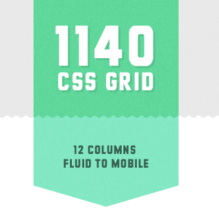
And then one day, Jared Tweeted about a new grid system called the, “1140 CSS Grid“.
Naturally, I checked it out:

The 1140 grid fits perfectly into a 1280 monitor. On smaller monitors it becomes fluid and adapts to the width of the browser.
Beyond a certain point it uses media queries to serve up a mobile version, which essentially stacks all the columns on top of each other so the flow of information still makes sense.
Scrap 1024! Design once at 1140 for 1280, and with very little extra work, it will adapt itself to work on just about any monitor, even mobile.
YES!
Check out this before and after screenshot of me resizing my browser:


It’s like magic!
I haven’t got my digital fingers around it quite, yet, but what I’ve seen so far, it’s pretty.
You can download this sweet 12-column css grid and the Photoshop template. How great is that?!
It works perfect with all the browsers that matter, and has been tested on new computers, old computers, netbooks, tablets, smartphones and even some feature phones!
I’ll be digging into this for my next CSS layout build, for sure!
Eric Dye
Support Lead at Valet, and Proprietor of DYECASTING. Human by day, gamer at night, lover of coffee, and all things spicy.


I saw this the other day and it looks really interesting. In the same kind of line, Nathan Smith (of 960.gs) has come up with a js method of simply serving css depending on browser width: http://adapt.960.gs/
It allows you to use 960.gs (which I love!) but also makes it very flexible. Both of these look very exciting and well worth having an experiment with.
I didn’t know Nathan had that!
Awesome!
Thanks for the link!
Problem with all these grid frameworks is that you can never have a fluid layout with mixed column sizes.
In the end, I find that it takes less time to create a css layout from scratch than it does to adapt an existing grid-framework.
Good point. To each his own, I suppose.
🙂
@evert, have you seen the fluid 960? http://www.designinfluences.com/fluid960gs/
Sweet link share. Fully love that action.
This looks pretty good, one thing I really liked about the 1140 was how it handled the image.
Excellent share! Bookmarked? YES!
I made html5 patisserie template with 1140 css grid great for making a responsive design. It can be used for variety of themes. Link: http://www.marijazaric.com/category/responsive-design-template/
Very cool.