Forms aren’t really where most people sit and down and create robust strategy documents and roadmaps, but maybe it should be.
It’s interesting: We spend a lot of time banking on the information we get from forms but spend little time making them intuitive, manageable and *gasp* attractive!
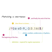
An interesting study done notes that changing up the style of the form design results in a 25-40% increase of conversion!
Wow. Take a look:

To see this in the wild, take a look here at Vast and also here at KBB.
Thoughts? I’m digging it. We do need to spend more time on forms.
[HT: LukeW]
ChurchMag Writer
For the Church


$21,000 for a Chevy Silverado!?! What are they…..oh wait. The forms.
Joking aside, the contrast is stark. I get the feeling sometimes when filling out forms that nobody is taking that information and reading it.
word. i love this strategy.
Although it doesn’t quite relate, I recently overhauled all of our aging forms (print versions) and took a lot of inspiration from the Web. They were the typical Name: _____________________ style and looked so chaotic that I didn’t want to even fill one out, so I scrapped the whole thing and went with the form field approach (box around answer text) and did a lot of study into the best layout… title above/title left/justified right etc. etc.
The result is much cleaner, more appealing and easy-to-understand forms that hopefully make the task easier on the user. After all, that’s what it’s all about…!
However I don’t always feel that ‘story’ style is the best format. That address field is not practical for typing a Street/Apt #/City/State, and you also have to read the whole thing. I’d much rather they put that text into the Comment field for me so I didn’t have to think about what to type!
good points. may not work in every situation, that’s for sure!
As it’s been pointed out, the story mode may not always be appropriate; however it sure looks nicer. And there are certainly other options besides ‘story mode’ vs ‘old lame standard mode’ that we could do on form design that are worth exploring.
Especially when you’re talking about that big of a difference on conversion response. That requires attention.
Good post, timely, haha.
i have little attention because i’m ADHD.
I think the story mode form is much more appealing to the eye and could generate more responses, although giving the writer more space can be useful too. Thats why the option to personalize is awesome.
love stories!
timely indeed John.
I’m finishing some tweaks on a new site for a client- and they have forms.
Anyone know of any form plugins for wordpress that allow style sheets? That’d be sweet.
gravity forms is awsome.
yay MadLibs
puahhahah
I love Tumblr’s (http://www.tumblr.com/) sign up form: just name, password, email.
The blog Signal vs. Noise has great posts about form design:
http://37signals.com/svn/archives2/push_optional_data_entry_as_far_back_as_you_can.php
http://37signals.com/svn/posts/1867-design-decisions-new-signup-form
http://37signals.com/svn/posts/42-screens-around-town-digg-the-nonist-others-online
http://37signals.com/svn/posts/399-screens-around-town-clickbank-commerce-bank-freshbooks
http://37signals.com/svn/posts/535-screens-around-town-zip-codes
http://37signals.com/svn/posts/317-screens-around-town-code-igniter-800-flowers-dreamhost
http://37signals.com/svn/posts/632-screens-around-town-snooth-british-airways-and-facebook
http://37signals.com/svn/posts/397-screens-around-town-brightkite-chicago2016-and-nba
http://37signals.com/svn/posts/535-screens-around-town-zip-codes?6
http://37signals.com/svn/posts/337-screens-around-town-zune-php-developers-network-planet-argon-and-amex?38
LOVE this. thanks.
This is one of those things that I KNOW… but fail on. After creating a smoking hawt site for a client, and creating all the SEO juice to get folks there. Creating the strategy to drive people to conversions… and then we present them with a boring form.
Boring forms NO MORE! I’ll cross the line in the sand. Who is with me!
me.
Kevin Hale (of Wufoo fame) gave a GREAT talk on the relationship between a user and an application at Less Conf in October. I still pull from my notes from that session when making decisions on user-flows, changing UX conventions, or even copywriting.
And yes, web forms need help. 🙂
looking for that interview.