What the heck is “em” ?
Wikipedia states:
An em is a unit of measurement in the field of typography, equal to the size of the current font.
So, if your font-size is at 16 pixels, then 1em = 16px.
The real question is, why should I use this measurement when dealing with typography in my web design?
- Style sheets with EMs are easier to maintain.
All text set in EMs scale to the body font-size. Only one element’s font-size has to be adjusted oppose to individually changing the font-size of every element. - More accessible to end-users.
End-users have greater accessibility since text is scaled based on user preferences rather than locked in static pixels. Someone with poor eyesight can easy adjust the text. 🙂
PX to EM by Brian Cray

This is a really nice px to em converter made simple. Choose your body font size in pixels (px) and out comes a complete pixel (px) to em conversion table, making elastic web design with CSS a snap. Now, converting pixels (px) to the elusive em is a complete no-brainer … don’t forget to grab the CSS, too!
CSS Typeset Matrix

This tool will not only help you convert your units of measurement into em, but it also helps you find margins and spacing values based on the font sizes and line-heights you input!
Another great thing about em’s is the scale. For example, if you are using px, the scale is as such: 1px, 2px, 3px etc … With em’s, you can go: 1em, 1.1em, 1.2em, etc …
Very handy.
But remember, when you bump the font-size up everything bumps up.
Eric Dye
Support Lead at Valet, and Proprietor of DYECASTING. Human by day, gamer at night, lover of coffee, and all things spicy.


Oooooh. ok.
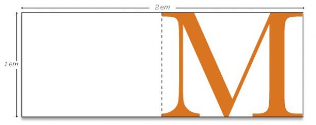
I’ve always heard: “one em is equivalent to the width of an uppercase M.” <~~ Which isn't particularly enlightening 🙂
… but true.