
Normally, to pull-off a full screen background image that stretches when viewed on larger monitors or browser windows, you need to use some jQuery. However, if you don’t mind kicking IE8 to the curb, there’s a really simple way to do this with simply using some CSS.
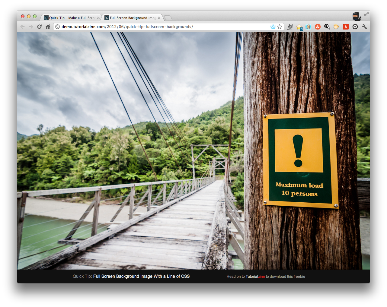
How-To Make a Full Screen Background Image
First, a big shout-out to Martin Angelov on Tutorialzine for throwing done this code — awesome stuff!
As you probably already know, to display a background image, you can tell how big it should be:
#elem{
 background:url('kermit.jpg') center center no-repeat;
 background-size:100px 150px;
 }
Simple enough.
However, Angelov draws attention to these two elements:
- Contain
This resizes the background image so that it fits entirely in the element;
- Cover
Makes it so the element’s background is entirely taken up by the image. The image is resized to the smallest size that allows it to completely cover the element. This is the property you want to use.
Here’s an example provided on Tutorialzine:

Makes sense, right?
Now, here’s how you pull it all off:
html{
	/* This image will be displayed fullscreen */
	background:url('background.jpg') no-repeat center center;

	/* Ensure the html element always takes up the full height of the browser window */
	min-height:100%;

	/* The Magic */
	background-size:cover;
}

body{
	/* Workaround for some mobile browsers */
	min-height:100%;
}
That’s it!
Just remember, no IE8 support.
[via Tutorialzine]
Eric Dye
Support Lead at Valet, and Proprietor of DYECASTING. Human by day, gamer at night, lover of coffee, and all things spicy.


Great, very useful. Tnx a lot!