I think the evolution of logos is quite fascinating.
It’s almost like seeing the design process, but over the course of years and years.
The infographic after the break, displays a number of different corporate logos as they’ve evolved over the years, and it’s interesting to compare design style in different time periods as well as seeing what outstanding features have survived the many re-boots.
Take a look and learn:
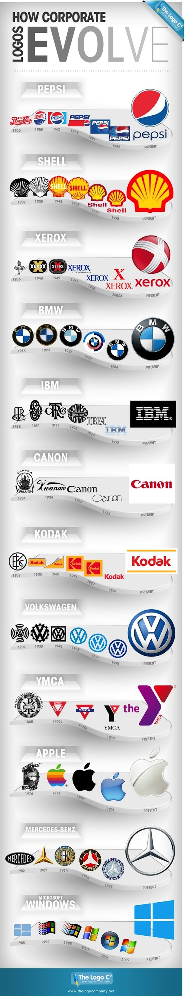
One thing I think that dominates is that most, if not all, tend to become simpler as time passes.
What’s your observations and takeaways?
[via Simple Pimple]
Eric Dye
Support Lead at Valet, and Proprietor of DYECASTING. Human by day, gamer at night, lover of coffee, and all things spicy.


I dig the YMCA one for sures. Solid find Eric
Thanks, man!
I like how the Xerox one from the future looks just like the one from 2004…
😀
What’s intriguing to me about the YMCA or The Y logo is, is that it took what people were calling it in slang or shorter form and turned into the actual logo or name used. Just goes to show how brand recognition and perspective can change and dictate a business.
True! Great observation.
It is interesting to me that Canon’s name and logo evolved based on it’s primary clientelle.
You’re right! Very interesting.