
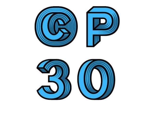
I’ve seen some cool fonts, but I’ve never seen a font that’s an optic illusion all by itself.
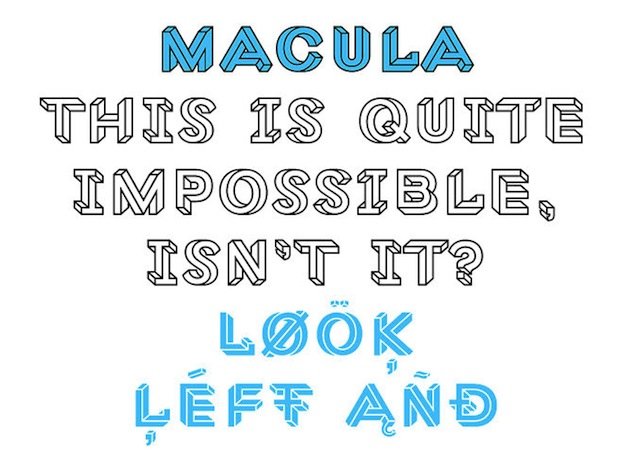
The Macula font, designed by the Dutch typographic designer Jacques le Bailly (who goes under the clever name Baron von Fonthausen), reminds me of the famous works of M.C. Escher. You keep looking and stuyding each letter to see where it goes wrong and you never quite get there.
Here’s what the designer said about the process:
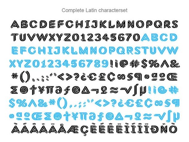
“Some letters were easy to construct, others were far more complex. Often the simple letters were the most difficult, because they offered very few possibilities or starting points. I wanted to avoid designing artificial shapes as much as possible. To keep the typeface lively every single character, down to the punctuation and floating accents, needed to have two versions, as if looked at from two different viewpoints. Sometimes the first version came together very quickly, and then it took an eternity to find a good second one.”
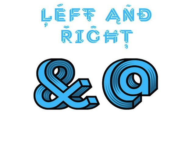
And this is what he came up with: a full set of beautiful optic illusion letters:
What do you think, pretty cool huh?
[via FastCodeDesign]
Rachel Miedema
Rachel is a full-time writer and former youth pastor who devours books. She loves Star Wars, has a weakness for Belgian chocolate, hears the mountains call all the time, and is a walking encyclopedia of completely random facts. Seriously, just ask her.


Speak your mind...