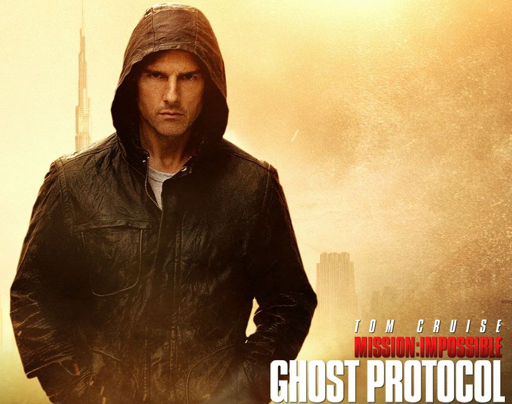

Have you seen the latest Mission Impossible?
Did you like it?
Did you notice the font used for the subtitles and captions?
This guy did:
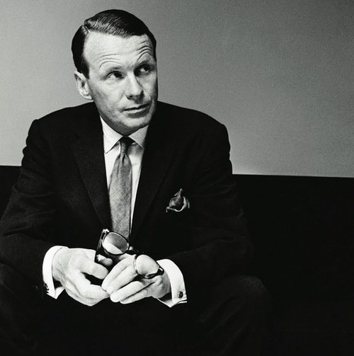
Matthew Butterick
Have you ever heard of him?
Matthew Butterick is a type designer. He has a degree in art from Harvard, focusing on graphic design and typography.
After seeing director Brad Bird’s film, he sent Bird a letter regarding the font choice used for captions and subtitles in the film.
For all of you who love good typography, please, read and enjoy!
You’re welcome ;-).
[via MB Type]
Eric Dye
Support Lead at Valet, and Proprietor of DYECASTING. Human by day, gamer at night, lover of coffee, and all things spicy.


GREAT movie…but an even greater letter 🙂 Personally, I’d like to see the response (if would comes) from Brad Bird.
A response would be awesome.
Ha! That’s awesome!
Loved the movie– hated the subtitles as well.
🙂
One word: Zing…
😀
Did he send a similar letter to James Cameron for Avatar? You know what I’m talking about…
Agh! The dreaded Papyrus font… I couldn’t believe my eyes when I saw that pop up. Totally took the movie down a notch for me.
You know that’s right!