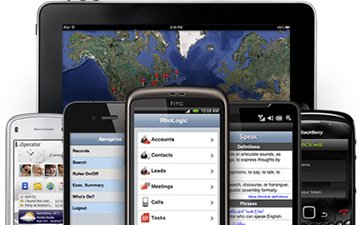
As I begin to think about my next web project, the thought of mobile access has drastically increased in importance. A year ago it was barley a consideration, but between such a sharp increase of mobile web use and an increase in the number of tools to transform a website into a solid mobile experience, it’s something that has to be considered!
Mashable had a solid list of ten things to consider as part of a mobile web design strategy.
Here they are:
1. Define Your Need
A mobile web design comes about because:
- It’s a brand new website.
- It’s a site redesign.
- Or, it’s a new mobile site and the current site will remain unchanged.
This will greatly affect how you approach your design.
2. What’s the Objective?
Make sure you understand the objective. For instance, if your Church website puts its focus on next weeks message, that’s what should be translated into the mobile version. If your Church website is focused on small groups, that should be the case for the mobile version, too. Your objective should remain the same and can be easily lost in desktop to mobile translation.
3. Know Your Past
Look at your Google Analytics. You need to know what devices and browsers are accessing your site. You don’t want to spend a lot of time building your mobile site, just to find that it isn’t working in a majority of your users.
4. Responsive Web Design
This is where key one comes into play. If you’re building both a desktop and mobile version of a site at the same time, you need to give responsive web design a thorough look. Otherwise, this just isn’t a reasonable option.
5. Simple Isn’t Ugly
Generally, mobile sites need to be simple. You don’t want to clog-up the bandwidth and device processing with drop shadows and bulging graphic files. This doesn’t mean your mobile site has to be ugly. You can do a lot of CSS3 and HTML5, plus, you don’t need all those gradients and rounded corners to create something easy on the eyes.
6. Best Layout
As you think about layout, a single-column structure tends to work best. Not only does this help with managing limited space on the smaller screen, it also helps you easily scale between different device resolutions and flipping between portrait and landscape mode.
7. Vertical Hierarchy & Collapsible Terms
Desktop design gives you more horizontal space, whereas your mobile devices tend to be more vertical.
A good way to organize things in a simple and digestible way is to set up a collapsible navigation. Taking your single-column structure a step further, you can stack chunks of large content in folding modules that allow the user to tap open the content that they’re interested in and hide the rest.
8. Click and Tap
The desktop experience is all about the mouse click, so you’re going to need to reevaluate your clickables. Your mobile users will need a bulkier area for navigation, etc …
Also, there are no hover states with mobile devices, so you’ll want to change your dropdown navigation to require a tap to revel your menu.
9. Feedback
It’s a good idea for buttons to visually change states when an action has been selected, and it’s important to let the user know something is in progress by way of spinning loading gifs.
Remember, the desktop browsers have various indicators built-in to show that something is in progress. Mobile browsers don’t make it as obvious, so it’s important to build visual feedback into your mobile site design.
10. Testing
Test the crap out of it.
It will involve a combination of installing the developer SDK for the platform (like the iPhone SDK and Android SDK) and using web-based emulators for viewing other mobile platforms.
This article provides a thorough breakdown of how to test a mobile website across the most popular platforms.
Ready to go mobile?
[via Mashable]
Eric Dye
Support Lead at Valet, and Proprietor of DYECASTING. Human by day, gamer at night, lover of coffee, and all things spicy.


I couldn’t agree more that everyone has to be thinking mobile as much as they are thinking about the web. The difference in user experience must be different and I think that you have highlighted many of the things to keep in mind.
The problem that I see is that most churches don’t have the time or staff to do this on their own. Even the free options out there don’t take most of the items highlighted in this article into consideration.
So do you think a church or ministry should be trying to do this on their own or should they lean on outside companies to help?
The tech is young and it depends on the Church size and resources. It also has to be decided if they should go mobile web vs. mobile app.
As of now, I would say go with someone like you guys for the mobile app, otherwise, Churches will need to sit-tight until they update their website. It’s getting easier and easier to implement a responsive web design.
Again, there are a lot of variables, here.