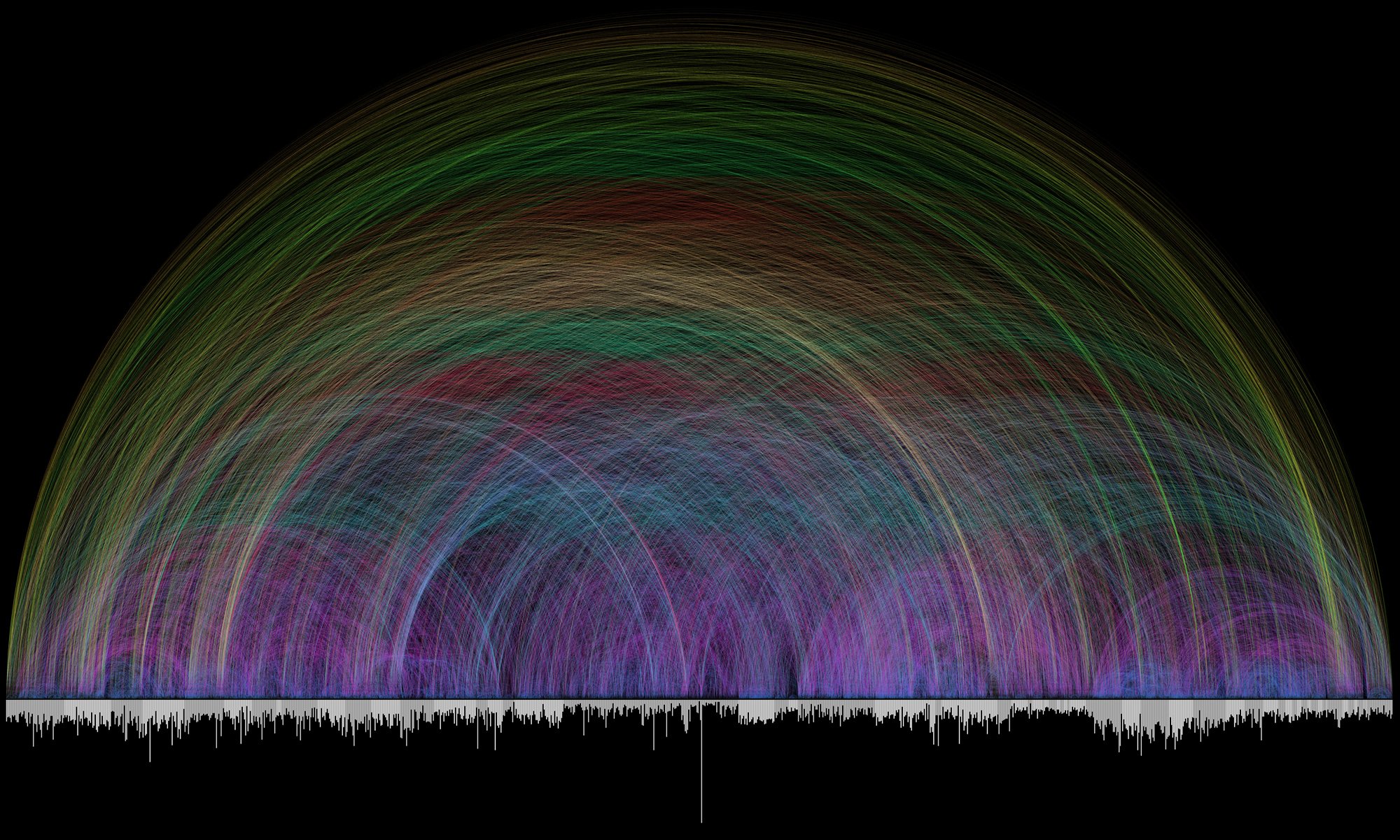
This infographic is visually beautiful as well as it’s context.
The bottom graph represents Bible reference frequency, creating a timeline of sorts as it presents the different books of the Bible. The colorful lines show the connection points of these references, changing color and arch depending on its reach, creating the most beautiful Bible cross-reference you’ve ever seen.
Take a look at this rainbow of promise: