
The Retina screens have now landed on laptops with the latest Apple MacBook Pro. Before, they were only thought of on mobile devices, but with Retina on the big screens, you’re website is probably going to look like crap.
Thankfully, it doesn’t have to.
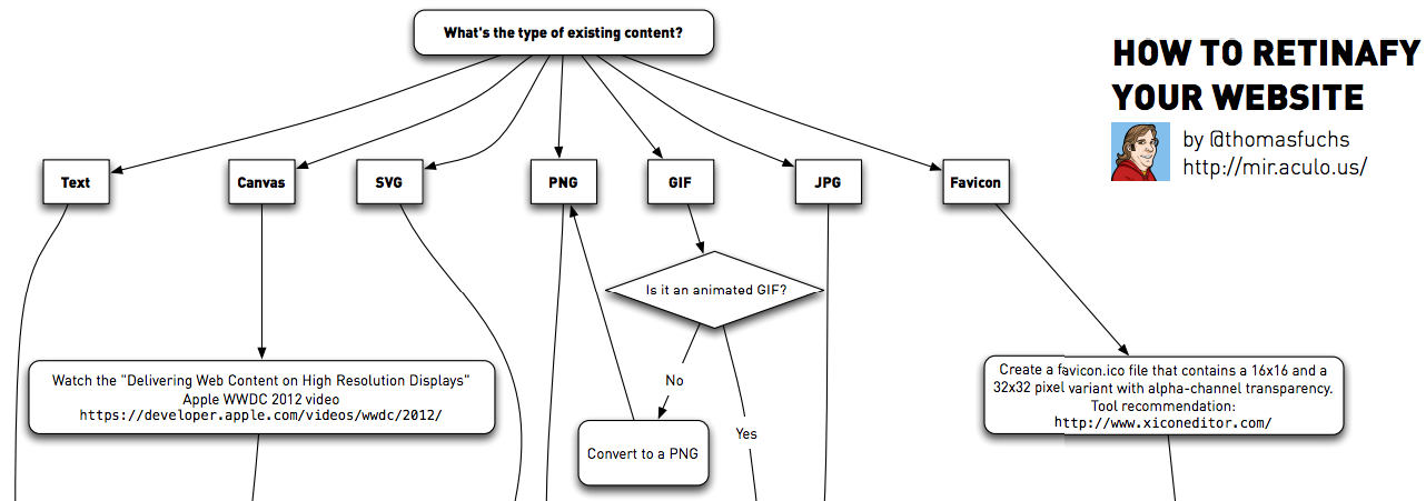
Thomas Fuchs put together a very helpful flowchart that takes you through the steps you need to make a website “Retinafied”
You can download the PDF, view it in your browser, and sign up to get the latest on his upcoming book, on his mir.aculo.us blog post.
Are you Retina ready?
Eric Dye
Support Lead at Valet, and Proprietor of DYECASTING. Human by day, gamer at night, lover of coffee, and all things spicy.


I use the Window Resizer extension for chrome. I added a size for Retina MBPs at 2880 wide. For my latest project, I made sure that the background (which I made at 1440 wide) would tile seamlessly. I made it that wide so that it wouldn’t have to tile more than twice for any display today because it was supposed to look like ripped paper and while the web content covered most of the middle, I didn’t want it looking like a tiny piece of paper repeated a ton of times.
I tested on my normal size MBP and again at 320×240 and 2880 to make sure it still looked good. I built it all as a child theme of “Responsive” in wordpress, so it looks good at all sizes, not just iPhone and retina MBP.
Nice info, Paul — thanks!