[Click for Larger]
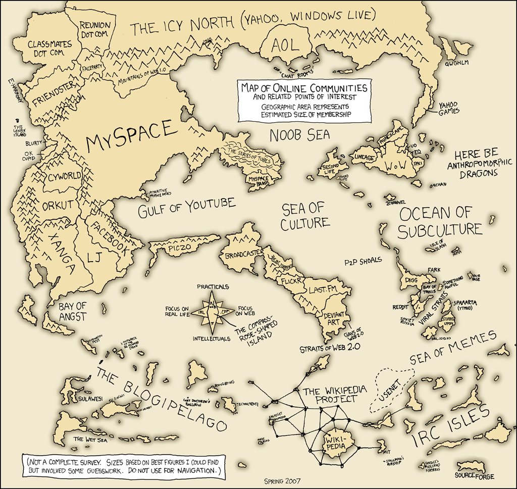
Do you remember seeing this “Internet map” of Internet communities from 2007?
When you compare it to the updated map from 2010 (picture below) it’s pretty interesting, but when you consider the typography of today’s web after only 3 and 6 years later, it’s pretty amazing.
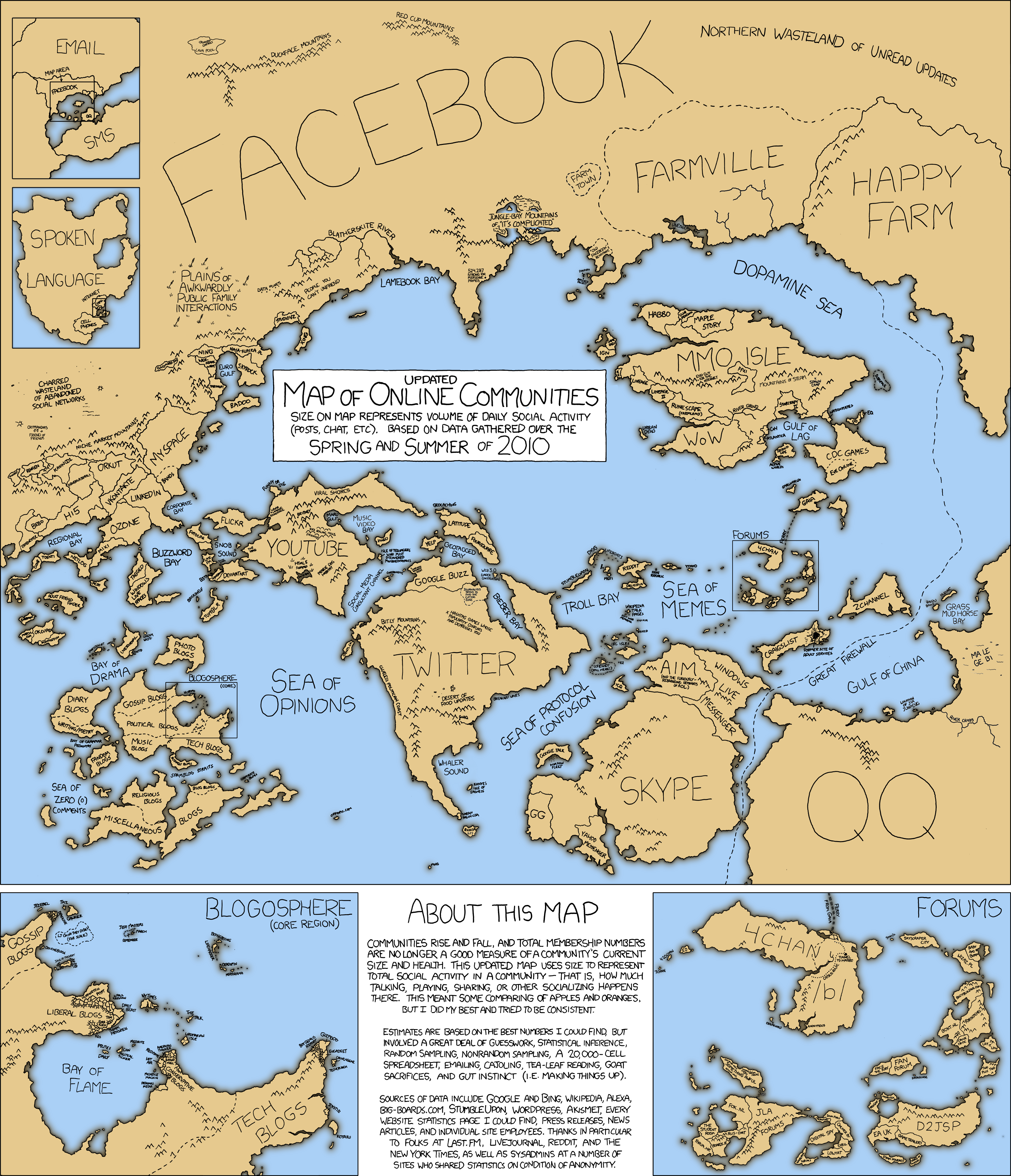
[Click for Larger]
How do you see a map of online communities in 2013 being different?
Eric Dye
Support Lead at Valet, and Proprietor of DYECASTING. Human by day, gamer at night, lover of coffee, and all things spicy.


Speak your mind...