Although I love dissecting data, tracking website statistics feels like a chore. It’s important to know my audience and what brings them to my blog, but I’d rather spend that time producing great content.
I have tried half a dozen solutions and most often use Google Analytics or WordPress Site Stats. WordPress gives me most of the simple, everyday things I might want to know. I turn to Google Analytics to answer further questions like:
“Am I getting new visitors?”
or
“How well am I connecting with the audience?”
Now, there’s an impressive new tool from Visual.ly which converts Google Analytics data into an infographic that balances simplicity with depth.
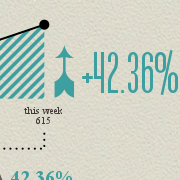
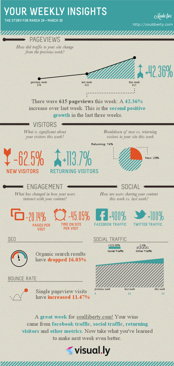
Here’s what it looks like:
Why It Works So Well
Dashboards present facts that require the viewer to draw conclusions. That’s the approach taken by almost all site analytics tools out there. Infographics are different. They tell a story, leading through a logical path to present the main idea. Someone else does the analysis for you, pulling out the most relevant information while laying aside the down-in-the-weeds stuff. It lets me spend less time analyzing and more time writing.
Notice how the Visual.ly team designed this infographic to lead from an overall traffic count into telling you progressively more about who is coming in. Are they new or repeat visitors? When they come, do they stay and read more? Do they like it enough to share with friends on social sites? It follows a natural flow to answer the right questions in the right order instead of slamming you with it all at once. Finally, it gives a snappy reminder of what’s going well. Keep doing that while you wait for next week’s insights.
Set It and Forget It
I confess: I sometimes give in to the temptation to obsess over visitors, page views, and comment counts. Having a weekly report helps me stay focused by forcing me to wait for the next one to show up. Visual.ly makes it easy to get started using your Google Analytics account. Here’s how:
- Set up Google Analytics, if you haven’t already
- Go to the Google Analytics Report on Visual.ly
- Connect to your Google account
- Select your site
- Watch the magic happen
- Click “Send Report Weekly” so you don’t have to repeat steps 1-5.
Bonus Tip: if you want to download it right away as an image, there is an inconspicuous link to do so on the bottom left just under the social sharing buttons.
What do you think is the most important thing to know about your online audience?
I’d love out hear about your favorite tools and how they help you better serve your readers.
Robert Rouse
I make pictures with data, especially the Biblical kind. Find me on Google+.


I saw this the other day on visual.ly but set mine up after I read this post. Thanks!
Man… Too bad I didn’t think of writing this.
Wow, this is way cool. I’m gonna try this as in right now! 🙂