The Church has always been one to flourish in areas where our eyes are deeply drawn to God and the 20th century church is no different. We have all heard of the stats about Europe being a religious wasteland and America close on its heels. Even with that knowledge, this infographic is both saddening and disturbing.
Personally, I would love for us to understand that missions is not something that we do overseas, but the ability to bring the Gospel to a group of people that we simply do not understand yet. Unfortunately, American Christians probably can say that their own backyard is a missions field, because we have not been doing a good job of bringing the Gospel to our neighbors.
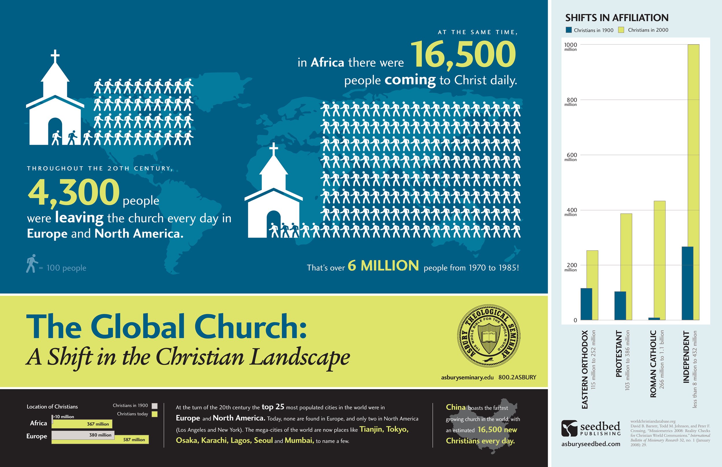
- 4,300 people were leaving the church in Europe and North America while 16,500 people were coming in in Africa.
- In a hundred years’ time, Africa has grown by 36x while Europe has only doubled.
- China is currently the fastest region of growth at 16,500 new Christians a day, despite strong governmental resistance.
How can we further the Gospel, even in places like America and Europe?
[HT Dynam.is | Image via swrightcreative.com]
Jeremy Smith
Jeremy is owner of ChurchAndMentalHealth.com and the Co-Occurring Program Coordinator and a Licensed Professional Clinical Counselor at a community mental health center. Jeremy has a history of working as a ministry director for Youth for Christ for 8 years and then working as a mental health and substance use adult counselor in Colorado and Ohio, specifically running an Opioid Residential Treatment Center.


That graphic gives a upper bound of 2.17 billion Christians in the 20th century. Some recent calculations of mine put us currently around 2.25 billion globally. 10 years and less than 100 million added. That’s a much slower rate of growth than the overall population rate.
What gets me about this graphic, and many other (more official) stats is that there is no discussion about the rate to leaving the church (which according to many missions groups is high), the rate of changing from one version of the Christian faith to another, etc. that this data should cause. IMO, the graphic is more of an incomplete sentence than saying something that’s not yet fleshed out.
Improving the quality of the faith should go before the numbers. But if you want to further the quality of the faith, then the faith has to get out of its Anglo-English dominance, and speak clearer to the mosaic of the faith that’s showing itself more resilient than the shifts like this graphic would have you believe.
The infographic actually does talk directly about the number of people (4,300 a day) leaving the church in Europe and North America. Also, if you would like further information about their statistics with people leaving the church in other countries, you can go to the World Christian Database that is cited in the infographic and where they draw their information from. It is my opinion that this infographic is actually “a complete sentence” but not a full argument for the debate on missions. That being said, I do not think the intent of the infographic is to enter that full debate.
We (American Christians) certainly do have a long way to go with understanding our faith outside the Anglo-English thought process, but those that have succeeded in the different cultures have at least done something right. From my experience with missionaries through numerous organizations and denominations, they are keeping culture in the discussion to the point that missionary families have become third-culture families and identify more with their mission country than their sponsored country.
Whether that difference can (or should) be expressed in an infographic to me is not worth the argument. Instead, it should be something that the missionary training, furlow, and member care parts of missions should focus on.