Quick question out to the community: Which styling option would you prefer we use for our Social Sharing (Twitter, Facebook, Buzz, etc)?
We’ve got two options to choose from. Please let us know which one you’d like us to use:
1. Current Version
Do you like our current setup where they are lined up below the content horizontally?

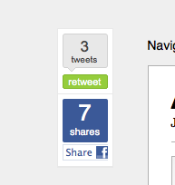
2. Floating Style
This is a bit “cooler” option that I believe stands out a bit more and scrolls with the content of the post.
You can see a live demo of how this works on the Standard Theme here.

Please let us know your vote in the comments!
ChurchMag Writer
For the Church


Floating looks good. But wld it detract much to leave option 1 showing down bottom? Particularly for “add this” to have more than just FB/Twitter share.
ah. a double call for the functions would result in a greater time commit for load. not really what i’m interested in doing. 1 or the other.
I personally like the floating style for the two major share options.
cool.
I vote for the floating version. Very convenient right next to the content no matter where you are on the page.
yeah, i do like the convenience.
current
sell me why?
+1 for current.
Because anything floating on the left makes me uncomfortable; like an evil eye watching me, waiting for me to share…. or else.
Not sure that I like the floating functionality, but I like the design of that option better than the current design.
why not the floating? anything in particular?
I guess I just prefer a design that doesn’t have loose floating pieces. I see the benefit of the floating aspect, but it’s maybe a little too prominent for me that way. Maybe an option to float it or not?
ah. i’ll take a look into that.
I’ve been trying to figure out how to do the floating one for a while as I love how Mashable.com has it on their site!
It keeps the sharing options in front of the reader which is better than blending in to the bg at the bottom of the page.
yeah obviously mashable was an inspiration.
Floating-gives more context
cool. thanks brad.
I think the floating deal looks pretty cool, personally. And I like the idea of seeing how many tweets a post has on top because it gives you from the get-go an idea as to how popular the post is.
sweet.!
I vote: Current.
I do dig the floating though. I see the convenience, just not sold on the design aesthetics. Feels like it takes away from everything else on the site. (content included) The whole time I’m scrolling, my eyes are watching those two buttons.
Plus if I wanted to share, I’d find it anyway. I think the goal of share buttons should be ease to find, not necessarily in your face.
ah. interesting perspective.
i like option 2…
I love the current version because:
1. it is neat
2. bottom of the post – ideally it is the destination AFTER reading the post
very good point.s
The current version fits cleanly with everything else, but would the bright green/blue look kinda awkward against the dark grey?
I’m probably going to say current..
cool, thanks stephen!
Numero dos.
I like that it’s “static”. This is similar to what Mashable is doing- and it’s VERY effective. I think the first option busies up the bottom of the post- detracting from what you want people to see.
cool man.
I’m a big fan of the floating buttons, option #2.
cool. thansk adam!
I like current version for choices, like to be able to click and share lots of places, opt 2 not so much.
but what if i added those in the sidebar too?
InspiredMag has a new floating sharebar with 8 options: http://www.inspiredm.com/2009/11/01/10-essential-social-media-blogs-you-should-definitely-bookmark/
yeah, but their implementaton is ugly.
agreed.
I prefer the current.
I think putting it on the side disturbs the whitespace in the page. Unless, of course, you want that sense that the webmasters are nagging you to share their content. 🙂
hehe. maybe i am…
The floating option does look hot.
But I would love the ability to easily share to delicious and other sites besides Facebook and Twitter.
Maybe keep both like has been said before…
i could add a delicious bar… or a “share this” widget.
I like the current option. It fits better with the overall theme.
I think it’s just personal opinion for me. I like the clean/simple look of the current version. The floating stuff always distracts me a bit.
I know I shouldn’t reply to myself. Someone give me a fail sticker.
I’ll look on the site but is this just for single posts or showing up for the home page as well?
I’m sure I’ll see the answer of the demo page….
just the single post.
I prefer the current version, but I don’t dislike the other. I’ve never really liked the floaty thing in general because it typically feels like a jscript hack, but your implementation is pretty clean and doesn’t feel cludgy. I do like the “counts” on the floaty.
yeah. it’s not a hack. it’s pretty.
Might I suggest a third option? Use a larger share button from addthis alone? Maybe throw Google Buzz in there as well. With the share button only you could even put it up next to the comment # chicklet, similar to how the BBC and some of the major news orgs do it. If you wanted something at the bottom, maybe throw in another tab at the bottom next to “about the author” entitled “share” or “share this” and you could throw in the entire kitchen sink for options with maybe those share links you were playing around with based straight php calls, all appropriately tracked with Google Analytics for the outgoing links of course…
hmm. that’s an interesting idea.
You’ll probably get more shares with the floating style just because no one will ever have to hunt for the link. However, I personally would like it if you kept the current style. I find floats distracting. They aren’t too common, so whenever something starts to float as I scroll my eye leaves the text for a second. I have to find my place and begin again. Just let me finish in peace and, if I like it, I’ll share your post using Shareaholic. =P
andrew, thanks for this/
Float that bidness.
I like floating as long as it floats in the margin & not over the content – the floater on mobile Gmail drives me crazy.
If I had a say, I would do something like this or this.
Keep it static until you start to scroll past it, then attach it to the top of the browser window while you scroll. That way it only scrolls when anchored to something and it’s not as distracting.
😉
Floating always feels weird to me. Like something is following me as I read. I prefer option #1.
I like the looks of the floating option, but my mind naturally looks for something at the end of the post when I want to share. Maybe I’m weird that way 🙂 I vote for the current version.