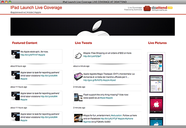
I’m always on the look-out for resources for testing responsive websites.
Sure, native is better, but not everyone can afford to have all of these devices, am I right?
Responsive Tools is another way to do your testing that’s easy to use and provides a silhouette of the device, adding a little extra when getting a feel as to how your website will look at the respective device.
Here’s how Responsive Tools works:
Responsive Tools

Enter your URL and hit go!
It’s fully interactive and multiple devices are available.

Devices included are:
- iPhone 320×480
- iPhone 480×320
- iPhone 320×568
- iPhone 568×320
- Android 240×320
- Android 320×240
- Android 380×685
- Android 685×380
- iPad 768×1024
- iPad 1024×768
- Kindle 600×1024
- Kindle 1024×600

Tell me, do you think it’s worth bookmarking?
[HT: avinash]
Eric Dye
Support Lead at Valet, and Proprietor of DYECASTING. Human by day, gamer at night, lover of coffee, and all things spicy.


Pretty cool! Ultimately, though, it’s just resizing whatever browser you’re currently using and not really showing how it’ll appear on those phones. Certainly a nice idea (and it’s worth bookmarking), but I’d still like to see something that can accurately show those various devices.
I’m with you.
I am a fan of the chrome extension “Resize Window”. It does the same thing, only in your browers, and you can set custom values. I find it helpful for figuring out where I want my breakpoints to be.
I need to check that out–thanks!
Love this! Totally saves me the time of trying to resize my browser to ever specification… (yes, I’ve attempted to do that…)
Haven’t we all? 😉