Last year, my church was desperate for a new logo. We’d had the same logo for over five years, and it was starting to wear on us.
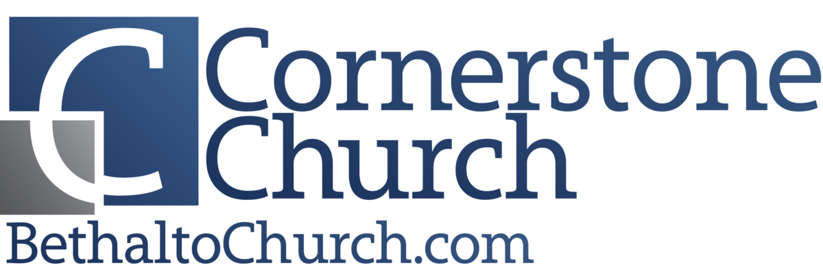
To be fair, it was a huge step up…
![]()
Anyway, we opted to simplify our color scheme even further and focused on making the imagery/symbolism even simpler:
![]()
We weren’t going for something easy to draw, but we did want it easily remembered.
Those two aren’t always the same thing, as Signs.com recently demonstrated in an incredibly interesting research project: Branded in Memory.
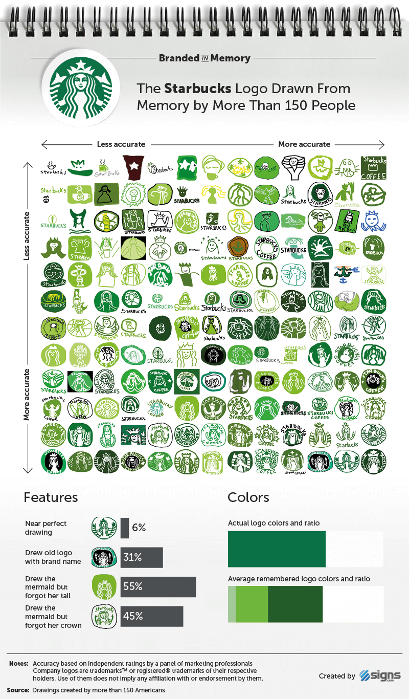
You can read the research there for yourself–and I think you should–but here’s the summary: they asked a bunch of people draw ten “famous logos from memory as accurately as they could.” The results were pretty stunning.
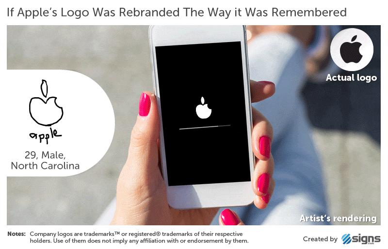
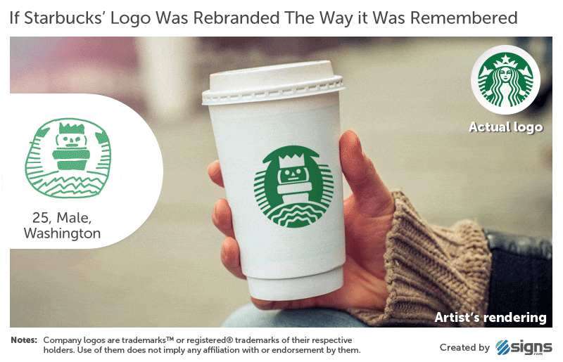
And that’s just two of the brands! There are 8 more, and the post at Signs.com also has done a visual plotting of how these attempts stack up compared to the real logos. Here’s one example:
So what should we take away from this? I think we should feel reassured and released from the pressures put on us by a design-heavy world. Branding, design, and all of that stuff is great. I personally love it, but let’s never forget that it’s supposed to be a help to us, a tool as we spread the Gospel. The moment we become a slave to design trends or even the pressure to continually update our branding, it has outlived its usefulness and has become a hindrance.
Let’s not let anything hold us back, no matter how cool we think it might be. Besides, I’d rather my church have a terrible logo and a sterling reputation for loving God and loving others.
So, next time you sit down in a staff meeting to discuss your branding, remember that if these mega-brands can’t get everyone to remember their logos, maybe you shouldn’t stress so much about it? There’s no way that your church puts as much time and money into branding as these companies do, so don’t feel like you need to craft the logo of logos. Because, in the end, the true brand you represent, the eternal banner you carry, is Christ.
[Images via Signs.com / HT: Bored Panda]
Phil Schneider
I'm a teacher and discipleship pastor. More importantly, I'm husband to the greatest woman in the world and father to a ridiculously cute daughter. I also occasionally scratch out a few blog posts.


I think one of the burdens or hinderances for logos design, especially for church, is trying to get everyone’s consensus.
How did you manage that process or did you have the fortune of the assignment going solely to designers and and not deacons?
Oh! Love the new logo by the way. Simple(r) is always better.
Good point, Blessing. We had a designer help us to narrow some thoughts and then our youth pastor ran it across the end zone. The deacons weren’t involved.
In our denomination, the pastoral staff is in charge of daily operations and vision-casting of the church. The deacons serve an advisory and accountability role.
Preference-wise, I’m actually really a fan of the one you changed it from with the blue and grey. I’m also a fan of getting a good enough brand and sticking to it for the long hull.
I really liked the old one, but I think the new one offers a fresh look. Plus, the subtle gradient of the old one was hard to work with. We had the same logo for over seven years, so I think it got a good run.
The interesting thing is that even after seven years, no one recognized the old logo. We’re hoping that the new one, with the two-tone square/diamond will foster more brand recognition.
I like the new one. It fits with “picture is worth a thousand words”. You give us good wisdom here. Branding is to help people remember who we are, not to create fantastic impressions of whatever and whoever we are.
Thanks, Kenneth. I think you make a great point. We use branding to communicate reality, not to distort it. Good stuff.
“…don’t feel like you need to craft the logo of logos. Because, in the end, the true brand you represent, the eternal banner you carry, is Christ.”
Good stuff. Thanks for a great article! Reminds me that simplicity is really key in logo design. It’s so easy to overthink a logo and make it hard to remember, which defeats the purpose!
The new church logo looks great! That diamond really stands out.
Thanks, Ryan! Simplicity is the key in so many things. Sadly, our world is more than a bit opposed to it.