
Less Framework 4 is an adaptive CSS grid system that includes four layouts and three sets of typography presents, all on one, single grid.
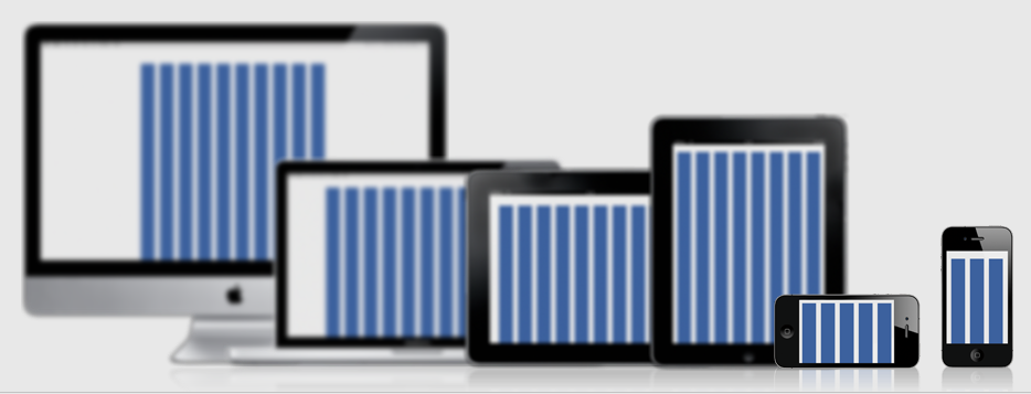
The four layouts include:
- Default Layout
10 columns at 992px. This is for your standard computer browser size or tablets in landscape view. - Tablet Layout
8 columns at 768px. This layout is aimed at tablets, providing a six column wide text. - Mobile Layout
3 columns at 320px. Perfect for smartphones. - Wide Mobile Layout
5 columns at 480px. A great layout for large mobile devices and smartphones in landscape mode.
I really like how Less Framework 4 adjusts for landscape mode on both tablets and smartphones.
Here’s the idea behind Less Framework 4:
The goal of Less Framework is to make building websites with multiple layouts efficient, and to make the layouts feel consistent. Since every layout is based on the same grid, elements used in one layout can often be reused in the others without changing them much at all.
Less Framework 4 is simple.
It does not contain any predefined column classes, pre-compilers, or other wizardry. The point of it is to let everyone keep writing HTML and CSS as they always have, because everyone does it differently.
Learn more, check it out and grab the code on the Less Framework 4 website.
Eric Dye
Support Lead at Valet, and Proprietor of DYECASTING. Human by day, gamer at night, lover of coffee, and all things spicy.


Speak your mind...