I should start by telling you that I am not a designer. I work with designers a lot, but I am a web developer by trade. As a result I find myself implementing designs.
And while talented designers are a rare and valuable commodity, I don’t think you need to be a designer to recognize certain design truths.
Here is an example.
Good visual design is composed every bit as much by what you don’t see, as it is by what you do see.
You with me? Sweet. Allow me, a developer, teach you a thing or two about design.
Pay Attention to What You Don’t See
I was reminded of this recently while reading The Smashing Book. In his section on effective user interfaces, Dmitry Fadeyev described a simple principle regarding the use of negative space, or “white space,” in web design. It became clear while I was reading that the rules governing white space are common not only to web development, but most creative endeavors including print layout, videography/cinematography, set/stage design, musical composition, etc.
And while it’s not uncommon for design principles to transcend, and permeate, several creative mediums, it is uncommon for me to stumble across something that transcends design altogether, and simultaneously provides an illustration for how I should parent my children, conduct my marriage, and follow my God.
A good writer would stop at this point and circle back to the topic at hand. So that is what I will do.
Here is what Dmitry has to say about white space:
White space is the empty space between various content elements, such as headings, text, and buttons. White space is a great tool for building relationship between different elements.
By tightening the space between elements, you can form groupings of related items. Increasing the space between these groupings will further accentuate their connection by separating them from the rest of the content.
Wow. I can almost smell the buttery awesome being poured into the skillet of my brain. Simmer it on low heat for at least 5 minutes, that’s good stuff right there.
But, for those of you without cookware-shaped physiology, or a noodle for metaphor, let’s get practical for a minute.
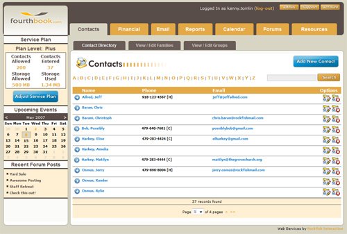
White Space in Web Design

White space is empty space on a page. It is that margin or padding or buffer around your navigation bar that separates it from all other content.
The lack of space between each navigation link, in conjunction with the white space outer buffer, inherently creates a logical grouping, telling the user that this collection of things here are related to each other in a completely unique way.
You can use white space to group and organize information. Because, just as the author says, white space builds relationship between different elements.
Grouping information is an important step because it unlocks the next one. Once you have groups, the next step is to determine the order in which you want a visitor to consume each one.
A good user interface designer uses white space (and other tools) to guide the user down the page, along a predetermined path.
Nothing is accidental.
Your web page is a pond. White space is the cool, glassy surface. Your user’s eyes are limber little froggies hopping from lilly pad (content) to lilly pad (content), traveling down your page. If you were a frog, which would you prefer? To painstakingly swim through every word from beginning to end? Or to execute a few, well placed hops and arrive at your desired destination in a fraction of the time, with a fraction of the effort?
White Space Beyond Web Design

White space is the diminuendo to near silence that the torrent of wailing and weeping string instruments interrupt in your musical score. It can be anything from the fade-from-black and fade-to-black transitions that bookend the final, dramatic scene in your screenplay, to a stripped-down set design that contains a single musician, a single light, an acoustic guitar, and persian rug instead of the usual production.
It is the slow pan of a city street at dusk, woven between the scenes in your short, to express the passage of time. It is the seemingly nonessential subplot in your manuscript that gives your characters the hint of common ground they will rely on as they work together to overcome conflict.
It is often subtle, obscure, and unobtrusive and, when used in this way, creates pictures in unexpected places.
Sure, white space may be a tool to build relationships on a web page, but it is so much more than that because it is based on the principle that white space, where ever you apply it, regardless of creative medium, can build relationship between any differing elements.
White Space in My Life
As I said before I don’t often find life lessons in technology books, but this one was difficult to miss. As I was reading it occurred to me that I need white space in my life. I need time to be alone with my wife. I need margin around her and I to group us together, to define us and build our relationship to each other.
We have 3 kids and my family unit needs time and space to exist away from friends and teachers and television and the Internet, and sometimes even relatives, to build our relationship with each other.
Finally, as a Christian, I have found that it is in my best interest to create white space in my life to help build the relationship that I esteem and cherish above all others. The one between me and my Father in Heaven. If everything written on the page of my life is a priority, if it is all written with the same font face, with the same font size, the same emphasis, and without regard to white space rules, then the truth is that nothing is a priority. Everything is on equal footing.
And I’m just like a limber little frog, making a long, cumbersome swim through a large pond, when I could have quickly and easily hopped across a few well-placed lilly pads instead. If only I had used white space to build my relationships.
images


I’m going to tell my wife that we need our relationship to work more like a well designed web page.
Kidding. This is good stuff (but I’d expect nothing less, Ames. Nothing less).
chris married up. seriously.
yes.
peace | dewde
Wow, Chris just created white space into my life while reading an article on design and it made sense. That is something I really need to work on with my marriage and family life.
Good stuff Chris.
Thanks for this post.
Allow me, a designer, to say that you nailed it here…great post!
thx man.
Chris your rock solid awesome.. I see you in a different light!
thx…i…think?
peace | dewde
I had to read this twice before I realized I’d read it once. That is- great writing (and article) Chris! I think I’m going to be reading this a few times this weekend. It’s like pudding- thick but oh-so-good. 🙂
“Nothing is accidental.” Epic.
Phenomenal post, Chris. You should write more often, the non-ASP.NET type of writing I mean.
Thx man!
peace | dewde