Stephen Fleming recently critiqued the Atlanta Business Chronicle’s homepage and he did it in a very cool way.
This would be a good exercise to check your current home page or a new page you’re designing. Sometimes design pushes out what’s really important or clients want to jam so much on the front page, they render their website ineffective.
This might be a slick way to really evaluate what’s on the home page.
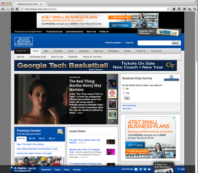
First, Fleming took a screen shot of the page: