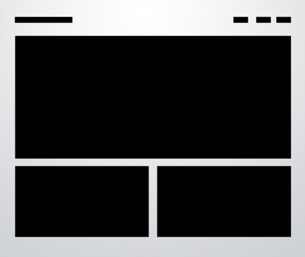
Yesterday, we posted about the Responsive, Mobile-Friendly Development Boilerplate called, Skeleton. A very nice responsive framework to build on. We also showed you 10 Solid Web Layouts, a summary of the ten basic layouts used in web design, today. A great page to bookmark for future use for sure! Today, I’ll share with you the code for three of the ten solid web layouts discussed, built on the Skeleton framework. Another great piece by the Design Shack’s Joshua Johnson.
[Read more…] about How To: 3 Solid, Responsive, Mobile-Friendly Layouts
Responsive, Mobile-Friendly Development Boilerplate
Response web design seems to be the direction of the web design community, as programming for multiple devices – desktop, table, smartphone – requires so many unique sizes. With a responsive design, your website flexes to the screen size it’s being rendered on.
Skeleton does just that.
It’s a responsive boilerplate based on the 960 grid system, with a small set of CSS & JS files that can help you rapidly develop sites that look beautiful on a 17″ screen or an iPhone.
Skeleton is built on three core principles:
[Read more…] about Responsive, Mobile-Friendly Development Boilerplate
JavaScript Library for HTML5 Canvas Based Heatmaps
I’ve seen a number of heatmap web tools, before, but this one really got my attention.
This may simply be the result of HTML5 coming on the scene, since it’s so much more powerful and really aids in bringing good looking junk onto the screen.
None the less, I think you’re going to want to get your hands on this JavaScript library!
[Read more…] about JavaScript Library for HTML5 Canvas Based Heatmaps