Arial, Helvetica.
Helvetica, Arial.
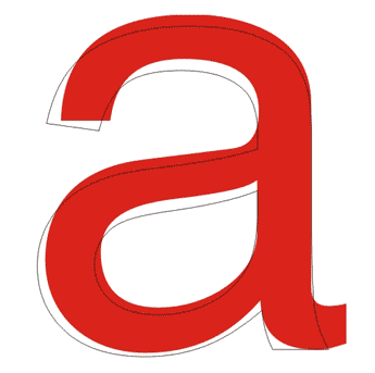
It’s all the same, right?
Here are some of the slight differences between the two:

Here’s a little history on the two (from I Love Typography):
Helvetica
Designed in 1957 by Max Miedinger, Helvetica’s design is based on that of Akzidenz Grotesk (1896), and classified as a Grotesque or Transitional san serif face. Originally it was called Neue Haas Grotesque; in 1960 it was revised and renamed Helvetica (Latin for “Swiss”).
Arial
Designed in 1982 by Robin Nicholas and Patricia Saunders for Monotype (not Microsoft), it’s classified as Neo Grotesque, was originally called Sonoran San Serif, and was designed for IBM’s bitmap font laser printers. It was first supplied with Windows 3.1 (1992) and was one of the core fonts in all subsequent versions of Windows until Vista, when to all intents and purposes, it was replaced with Calibri.
Helvetica vs. Arial was more colorful about it:
Helvetica was developed in the Haas Foundry of Switzerland in the 1950s. Microsoft distributed a typeface called Arial, a very similar typeface, that comes bundled with every desktop computer. Thus Arial has now overtaken Helvetica as the standard font in practically everything done by those who don’t know better.
Considering that Helvetica vs. Arial also has a Flash based game where you control a Helvetica font and try to beat-up Arial, they may not be the most objective.
Helvetica seems to be the designers choice.
Why?
Let me ask you:
Helvetica or Arial?
[via I Love Typography & Helvetica vs. Arial | Image via Imgur]
Eric Dye
Support Lead at Valet, and Proprietor of DYECASTING. Human by day, gamer at night, lover of coffee, and all things spicy.


long live Neue Haas Grotesque!
LOL!
Agreed Jared! Hel “freakin” vetica 🙂
Love it.
Helvetica but i must admit i really like Calibri!
I think a few people shuttered.
Why does this topic actually hold my interest for more than a second? Why am I thinking of actually reading a book on Typography? WHAT DOES THIS MEAN?
It means that you are in the right place with us other nerds
I second that.
The Eric’s agree.
check out Helvetica on netflix 🙂 its awesome
Now I’m a little scared. I’m spending my afternoon watching a movie about a type face. Why won’t my 6yo and 4yo watch this mind blowing documentary?
Crazy, right? I mean, come on, it’s about FONTS!
Hey, that documentary was a cool look at design in general. As well as a cool font.
My vote goes for Helvetica. Sorry Arial, you just don’t measure up.
🙂
Am I weird for also liking Tahoma?