I’m part of a pastors’ LinkedIn group, not because I’m a pastor, but because it has a church tech subgroup and you need to be a part of the main group to be a part of the subgroup.
In the main group, someone posted the following topic:
“Post your website.”
I posted mine, but also started to watch the others and noticed something about many of them. The ones I noticed had simple to fix problems that could make them more effective in spreading their message.
So that I’m not calling people out, I’m not going to post links to the offender’s pages, but just describe the problem and offer solutions.
1. Not having your own domain name
I understand that some ministries are quite poor. I know mine is, but quite a lot of ministries I’ve seen piggyback on other domains. Is your church website (I’m making these examples up) firstbaptist.blogspot.com or mainstreetunitedmethodist.wordpress.com? There really isn’t a great excuse for this. Domains are often in the realm of $10 a year, yes a YEAR. There are exceptions to this. You can get a “.tv” domain for about $30 a year, but that’s still for a whole year.I’m not saying you should abandon the platform you’re on if you don’t want to, but you can redirect a domain from the registrar quickly and easily so firststreetcommunitychurch.org leads to 1stcomchurch.wordpress.com. I’ve heard concerns about using a certain registrar to register a domain name because of their advertising tactics. That’s why I use NameCheap.com which costs the same, but doesn’t advertise in the same way and also doesn’t make you click “no thanks” a bunch of times to all the stuff you don’t want.
2. Building with a free wysiwyg editor and not paying to remove the ads
I personally don’t like some of the “what-you-see-is-what-you-get” (aka wysiwyg) services out there. Some aren’t bad, but others seem to breed bad choices. Still, you can make a decent site if you hold back from what you “can” do and stick to what you “should” do. Once you’ve done that, if you’re going to go with one of these services, please pay to remove the “build a free website with us” tag from your site. It would be a little like watching the “Billy Graham Crusade” on television and having an ad for “Shure” microphones on it. I think they’re great microphones, but the ad for the tool you used to create your site is problematic, especially since you’re getting a free website in return for the ad. For some sites, ads are appropriate, but not for your church’s main site.
3. Automatically playing media
I don’t like either way of doing it, but if you must have audio or video playing automatically, make it stop after the first time I visit your site and make the stop button obvious. I often get to sites by clicking on a link and opening up a new tab. Sometimes I’ll open up five or six new tabs this way. Imagine if one or two started playing a video of the pastor welcoming me or a midi file of Bringing in the Sheaves. Now, what if all of them did this? It could be pure chaos. The best thing to do is to avoid auto-played media altogether.
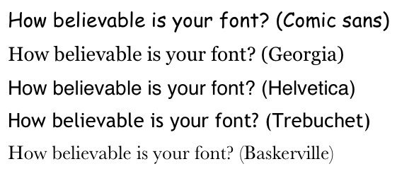
4. Using fuzzy pictures
There are a couple of reasons why images are fuzzy. Perhaps the focus was a bit off when the picture taken. What I’ve noticed though is that a lot of times the picture is fuzzy because it was too small for the space and was blown up into a larger version. If you blow it up 10%, that won’t cause this problem. If you take a 50 pixel image and blow it up to 100 or 200 pixels, it will. If that’s the case, just create a new image. Take a new picture or remake the graphic. Do whatever it takes to get a sharp image.
5. Not updating information
It’s one thing if you don’t update old stuff that is replaced by new stuff. It’s quite another if the front page says, “Celebrate the new century next Sunday.” I made that up, but I’ve seen a lot of calendars that are a lot like that having only outdated entries. If you can’t keep up with content, leave it out. I’d rather not see a calendar than only have entries from six months ago. It’s better to not have a feature than to have it, but it’s outdated.
6. Tiling a non-tiling background
I’ve seen this a lot. A background should either tile seamlessly or not tile. I saw a couple of sites where the background was a photograph that repeats over and over again, but it looks like someone took a single photograph of the beach and used duplicates of it to wallpaper a room. Often the website will be wide or tall enough that one of the “tiles” is cut off. It looks like it’s random or unplanned.
7. Not having a “contact us” page
I’ve wanted to contact someone or a ministry and not been able to do so. The worst thing for a church is not to be able to answer questions from people who want to go, but don’t because they couldn’t ask a simple question. There are plenty of ways to do it and I don’t care if you have a contact form or have the phone number, email address, etc. Either way I want you to have a way to interact. A website is a great tool for connecting with people, but only if you provide a way to interact. Don’t forget to include that information.
So how about you?
What “sins” have you seen?
[Image via Dokimos.org]
Paul Alan Clifford
Author of Podcasting Church (http://amzn.to/podcastchurch), Tweeting Church (http://amzn.to/tweetchurch), and The Serving Church (http://amzn.to/theservechurch). Paul blogs regularly at his technology in ministry blog: http://TrinityDigitalMedia.com and live-streams tech and creativity at http://ChurchTechCast.com


I’m not on staff at a church right now but have been in the past and hope to be again. This is a good, useful article.
Question: what tool(s) are you using to help create a site and what’s the cost in getting the ad removed? I’ve got a lot of HTML experience, plus some CSS experience and less so skills with WordPress. But I would maybe pay a few bucks to get a really elegant end product without reinventing the wheel to do it. FYI, at this time the site I’m think of would be for me – as a front Page driving and managing my blog, online resume and whatnot.
Thanks for your efforts and help.
Unless your church (or you) have a full-time web design/IT department, I steer everyone who asks to WordPress. IMHO, it’s the best combination of aesthetically pleasing design and usability, both on the front end for users and the back end for staff. I think it’s way more sustainable versus custom CMS’s and hand coded sites.
I agree (see below). If you have no other choice though, at least pay to have the branding for the paid service removed from your site. 😉
WordPress is definitely the “free” platform of choice as it is (as already stated) the most aesthetically pleasing as well as functional.
HOWEVER
If you have some HTML and CSS skills, then I’d use Blogger as you have more control over your design and layout than with WordPress. With WordPress, you also can’t get rid of the top “nav” bar, even if you’ve done the whole domain rerouting thing (unless you’re self-hosting a WordPress.org theme).
Another reason I suggest Blogger over WordPress for the more skilled user, is Blogger’s ability (and allowability) to use JavaScript. Outside of WordPress’ developed widgets, WordPress removes any form of JavaScript coding. This means that you cannot find a nice piece of code and simply insert it (like if you wanted to have people update a Google Docs Form).
I should say that when I say “WordPress,” I mean “WordPress.org” the open source software, hosted on a rented server. I don’t mean “WordPress.com,” since by the time you pay to do things like have your domain, use your own css, etc., you’ve paid more than cheap hosting would cost. Most churches aren’t going to be popular enough that the bandwidth advantages of “WordPress.com” will outweigh all the detriments of going with them and paying in a “nickel and dime” fashion for all the stuff you actually need will cost more.
Paul
I use wordpress myself, but the sites I was referring to were using webs.com, yola.com, weebly.com, and wix.com. These sites are right for some people, but I always seem to bump up against the limitations of “simple, don’t hire a web designer” tools when I give them one more shot, so I’ve quit and gone back to good old HTML and CSS with WordPress and I’m much happier with the results.
I never finished any of the sites I started with these tools so I didn’t get to the point of needing to know the price. They’re not expensive, though. If they were, you’d be better off hiring a designer.
I think of web prices in terms of how much it would take to hire someone to do it. If you can get a designer to created a template for $500-1000, that’s cheaper than having someone on staff take a month out of their life to do it, unless you pay your staff minimum wage.
A scary number of church do not have address and/or phone number on the home page. With the demise of “phone books” (anybody remember them), the home page is the equivalent of the Yellow Pages for most people.
That’s why, at the very least, a contact us page is a must. It’s easy to forget, but I always try and make sure that my clients include it.
The “not updating content” is a stickler for me. Srsly folks, if you’re going to be on the web, make it a point to update your site on a weekly or at least bi-weekly basis. I was the web guy for a small church in my hometown, and we had one of the best church sites in the area – I made sure of it.
How many things are becoming expectant online now of churches?
* Listen to sermons online (or AT LEAST podcasting them.)
* Give online.
* If you’re multi-campus, live viewing of service online.
And this is a great list. Thanks for sharing our sorrows. 🙂
You’re welcome, Micah. I know from experience that content drives traffic; my weekly numbers on my site have become my daily numbers since I went to a daily blogging schedule.
I know pastors are busy, so the fact that your church outsourced it to you (whether that’s the reason it happened or not) is a brilliant solution.
Great article. Good points; all of them 100% accurate. I was evaluating my own designs as I was reading and was gratefull to have passed 😉 (in my own mind at least).
I think that your article is extremely important for urban churches where people have a much wider selection of churches to choose from. Another great article in the same vein is by Justin Wise (http://justinwise.net/church-websites-senior-pastor). The two key points that stood out for me was that people wanted relevant information and they didn’t want to have click around a whole bunch to find what they were looking for.
I think if I were a small church, I’d put extra money into the website because you can compete with larger churches who have more resources by catering to people who are looking for a church and answering their questions proactively.
I’m about to start a website for a small car dealership. We almost didn’t buy from them b/c the site wasn’t updated, but it was close enough to our house that we though, “What the hay?” and went over. They almost lost our business and now, I’m going to fix that. Churches are the same way.