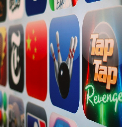
You know, there’s a difference between a mobile “site” and an “app.” I still hear the wrong language being used in the context of mobile development but let’s all do our part in educating the masses, shall we?
Ok, now that we’ve got that out of the closet…
If you’ve been considering developing a mobile app for your ministry (or having someone else do it for you) there’s already a lot of great advice out there. We here at ChurchDrop is just one voice in the sea of many, so pick and choose wisely!
But here are a few things that we’ve learned as we’ve developed mobile apps (and have watched others) for ministry:
The Big Difference
One of the biggest things that you must remember, from a designer’s PoV (Point of View) is the need to be aware of some basic fundamental principles of human-computer interaction: The finger.
It’s a fat and lumpy thing that finger of yours (and your visitors).
Navigation is everything and you’re going to want everyone’s fingers (and thumbs) to be able to press those little buttons.
In light of this, here are 5 Tips for Designing a Mobile App for your ministry:
1. Mock Ups and Wireframes Are Awesome
Make mock ups; lots of them. Spend a lot of time in shop or whatever app you use to create wireframes and spend a good deal here detailing out what it should look like. Don’t skimp. Seriously.
2. The Flow Bro
Information architecture is just as critical, if not more so, on mobile apps. Make sure you’ve mapped out the “experience” and get feedback (lots of it).
Focus on the content and the operations will naturally be developed. Create visual maps of the data flow and keep it coming nicely.
3. “Borrow” Best Practices
There’s nothing wrong with looking at some of the best apps out there and strategically borrowing their use in your process and app. The way I see it is this: They good ones are good for a reason, and that reason is that they are widely used.
Period.
There’s no shame in creating, contextually, a great app based on industry best practices.
4. Screen Tests Are EPIC
Design and then cut it into a mockup on the devices. This will not only give you a better picture of how it’s going to look in the wild but you’ll also be able to ‘sell’ the concept to the people who matter.
Use all sorts of handset screens to do this; the more the better.
5. Visual Styling and Functionality Balance
There’s going to be a fine line between your visual styling and the functionality that you plan to provide. Make sure you’ve got a good balance and err on the side of functionality before fashion every single time.
If the people can’t use it you lose; I don’t care if it’s “Van Gogh on the iPhone” because your success is measured upon usage not the “oohs and the ahhs”.
ChurchMag Writer
For the Church


Good thoughts! To add on:
“You’re never done, yet” – Though it could be argued that if you did it right the first time, you wouldn’t need to make changes, but we all know that’s not how it works. Just because you sold yourself on your UI, doesn’t mean it will translate to everyone’s needs and uses the same.
Be ready and willing to make changes, and continue to look for ways to improve.
love that.
Oh man, so many thoughts:
For mockups and wireframes, we use a couple different tools: Skitch (for rough layout) or Balsamiq (for more specific wireframing). We only use wireframes for larger feature sets though. If it’s a single page or extra view in a mobile app, we go straight to the code. (@andyknight is our master wireframer)
We focus pretty heavily on “user flow” within our mobile apps. When building out a new feature set or starting with a new platform, we always work from a user flow after setting the functional requirements in stone. For us, we use mindmapping to craft the user flow in a method very much like 37Signals’ method (but we came up with it first). It’s a HUGE help in creating a logical path for users to experience the Bible. (@jt is our master mindmapper for user flows)
For testing, we have about 12-15 different devices we test on for our mobile web application. But any native mobile apps get tested internally on 3-4 devices and externally on another 10-15 devices. Test, test, test! (our mobile web guru is @jmccartie. he’s a flippin’ mobile web genius.)
And for balancing design and functionality, boy you have to be super-stingy when creating something for a 3 inch screen (or smaller). This is one area where churches traditionally suck, so extra care and educating the powers-that-be is paramount. (@doyoufoster is our voice of reason for balancing design and functionality. he’s our famous digerati ninja.)
Sorry for the epic comment. Great post John.
dude, love your comments. they are like uber posts.
would love to see the 8bit mobile app. word.
It’s worth noting that non-profits can get Balsamiq for free here: http://www.balsamiq.com/products/mockups/desktop
Fantastic app.
word up.