A website has many different facets to it. For a website owner, you understand there are many different ways people will get to your website. Some people may simply write in the URL and hit go. Others will click on social media posts to go directly to blog articles. These are straight forward. The third is via a landing page via an advertisement, email, or especially stages link.
Description: In online marketing, a landing page, sometimes known as a “lead capture page”, “static page” or a “lander”, or a “destination page”, is a single web page that appears in response to clicking on a search engine optimized search result or an online advertisement. (Wikipedia)
Why Landing Pages?
I’m currently working on a personal projected called ChurchAndMentalHealth.com, which I highlighted why on a previous article. One project I am slowly tackling is trying to put together a devotional eBook to give to churches, I want it to tackle mental health issues from a Biblical perspective in a devotional format that will make you think regularly and is consumable for morning devotionals.
I plan to give it all away for free but want to have a sweet landing page where people can come from Facebook or Instagram with custom ads or social media posts so that people can download it. The landing page will have them sign up for my email newsletter in order to get the eBook, the eBook going out to those who already have signed up.
The 3 Christian Landing Pages I Love
Instead of reinventing the wheel, I looked into landing pages out there to see what was working and take the best parts to smash them together with what I was wanting and already thinking of. I went through my Instagram and Facebook feed not in search of just the content in my feeds, but also the advertisements that were showing up from church techie ads that showed up. Here are the three that I discovered in my research that I love, each unique.
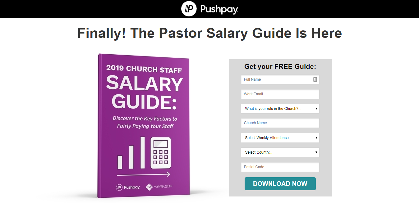
Parable Group
What I love about the landing page is that they get to the point. Instead of someone jumping to the page and having to search for what needs to be done, it’s very clear. You don’t have to go hunt. If I clicked your advertisement, I probably have already committed to wanting the eBook. Don’t waste my time trying to find the download button or sign up form.
More details are below the sign up form, though I think it’s not necessarily clear. I didn’t see it the first time I went to the page to look at the eBook design and only saw it during this research. I do think they ask for too much information to get signed up to their newsletter and download their eBook, but I still got it anyways.
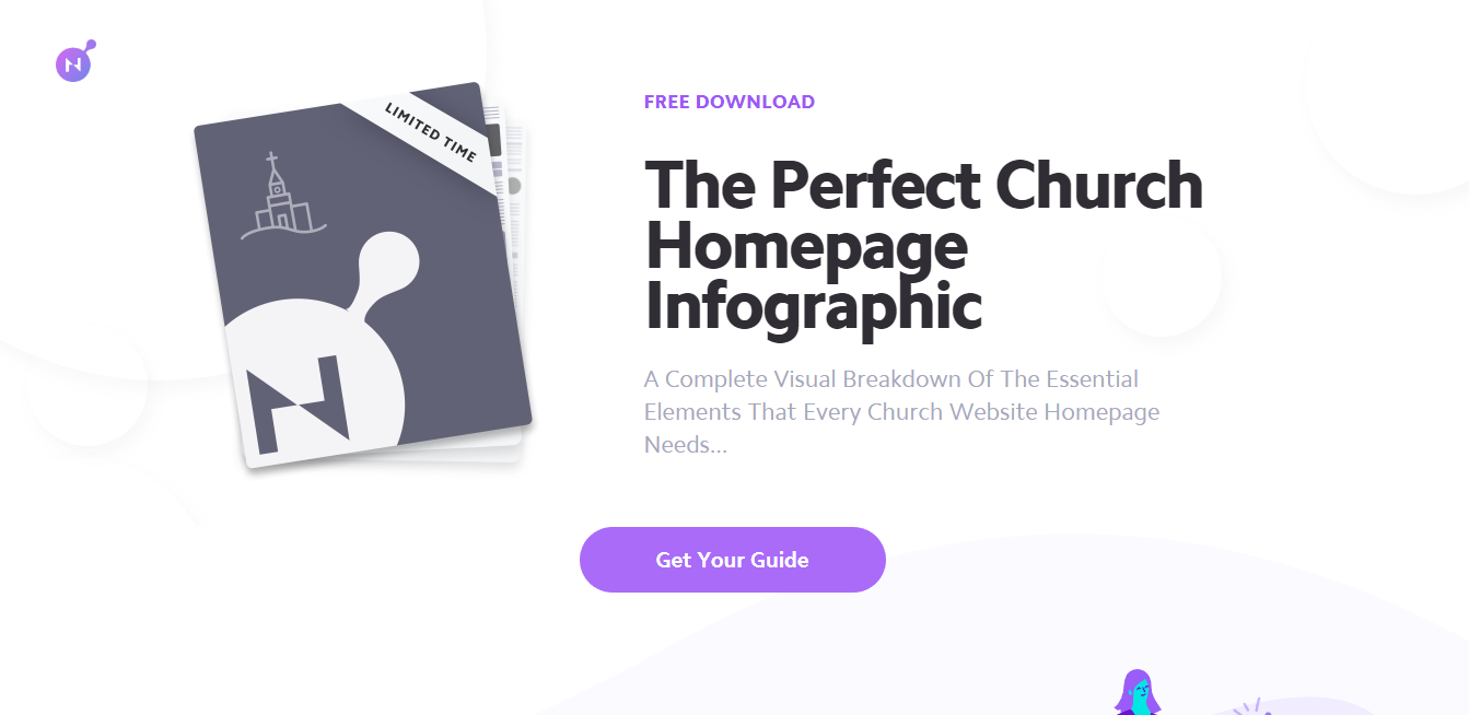
Nucleus
This one feels different because they are still trying to sell you on this page. Yet, the previous one only had one place to get the eBook, this one makes the same action call “Get Your Guide” three different times. I’m wondering if this is a single landing page that comes from a blog post, newsletter, or Facebook Ad (where I found it). Best practices would say you should do a unique landing page for each. I also love that this page is familiar with it’s branding whereas the Parable landing page actually differed from their main website.
The downside is that if I already said I do want to get this eBook, their is a whole other action I have to do to open up the contact form to enter my email. Marketing says you want to have as few actions between the initial presentation and the final act you want your customer to do. If I see your Facebook ad, I should be signing up nearly immediately and Nucleus does add an extra click in there. Finally, I feel the header text does not explicitly share we are getting an ebook to do infographics, a little confusing.
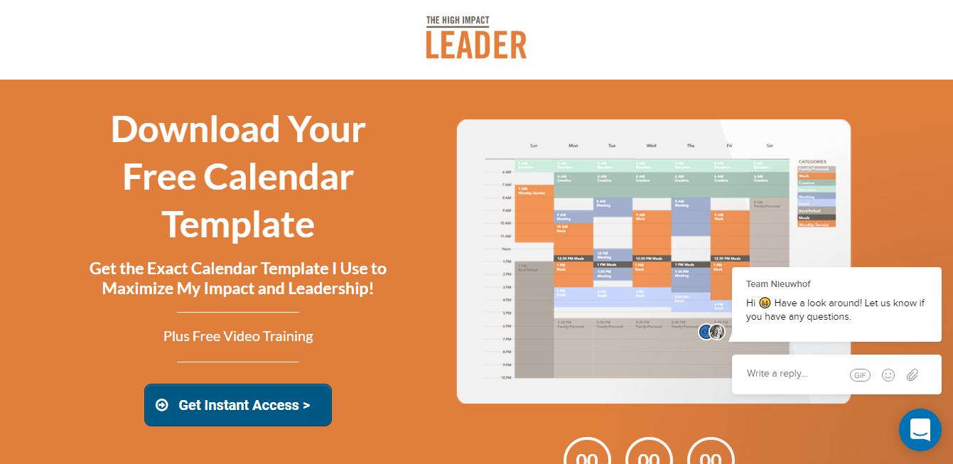
High Impact Leader
This page is a perfectly classic landing page. It honestly reminds me of Michael Hyatt’s marketing strategy. It has a countdown (which is now expired) for when the course happens, it gives a great image and briefest of descriptions, and crystal clear design to make you look at the blue “Get Instant Access” button. Best of all, something I won’t be able to implement, is the little chat window which is great. And one hidden final thing about the page, nearly the whole page is above the fold. That’s impressive, for sure!
Again, you do have to give an extra click. I also don’t know what kind of medium I will be getting when I download it. Is it an Excel sheet or something that is it’s own stand alone app? A minor inconvenience.
What do you love and dislike about these landing pages?
What other landing pages have you seen out there that you feel are the best of the best?
Jeremy Smith
Jeremy is owner of ChurchAndMentalHealth.com and the Co-Occurring Program Coordinator and a Licensed Professional Clinical Counselor at a community mental health center. Jeremy has a history of working as a ministry director for Youth for Christ for 8 years and then working as a mental health and substance use adult counselor in Colorado and Ohio, specifically running an Opioid Residential Treatment Center.


Speak your mind...