
What does 2016 have in store for us?
Well, we have some long-awaited blockbusters coming up this Summer (Zack Snyder’s Superman Vs Batman, Russo-brothers’ Captain America-Civil War, X-Men – Apocalypse… Oh, you don’t care. Sorry, I am a queen-nerd and sometimes it’s involuntary).
As far as the web designer community goes? We see our fair share of trends come and go, and it looks like this is the year when some design approaches will be en vogue.
Note: This article isn’t just to tell you whether to go with ‘stars’ or ‘stripes’, that’s a subjective matter of context, opinion, and preference. This article highlights the important shifts in web design ‘train-of-thought’ (so to speak) that will mark a significant change in the way we have looked at designing for years. If you are looking for “what the ‘celebs’ are designing with these days”, this isn’t the article for you.
So designers: Dredge up all resources you can and prepare to embrace the…
• Above-the-fold Field
The principle: Going by the age old adage of “Show and Tell”, above-the-fold space is where the narrative “showing” takes place. This is the space which is meant for grabbing attention. This is the most important real-estate on the page.
The Shift in perception: Above-the-fold field will now have one purpose, i.e., compelling visitors to scroll down.
We have seen some really creative uses of Parallax, Hero images, carousels, sliders, videos, and what-not with a growing focus on performance perception (meaning: front-end loading times need to be fast just to give the users a sense that something is happening).
This trend, regardless of where you stand on the debate (pro-fold or against it) will continue to hold strong and may become a design principle in itself by the end of this year. This can be said with certainty if one looks at the growing consciousness about ‘storytelling’ and the countless eyetracking studies proving the 80-20 rule (80% of user’s time is spent looking at 20% of the web page).
The innovations: No more auto-forwarding sliders as designers seek to give users greater control over what they see on the page. Another emerging trend is dynamic, interactive banners for the sake of engagement and usability.
• Cards
The principle: What started with Pinterest also spread-out to portfolio and e-commerce websites. The underlying simplicity and organization, along with the way they work with Flat 2.0: Cards are the hottest design trend right now.
The Shift in perception: Cards are also being adapted to better suit other types of websites, specifically the media rich and content-heavy ones.
The Card style is perfect for a mobile-first world. With that in mind, everyone will be trying to incorporate this style in even more fascinating ways with business portals, blogs, etc.
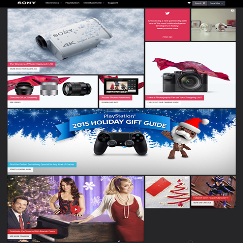
Here are a few examples from websites like Sony:
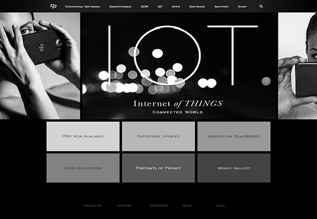
Blackberry:
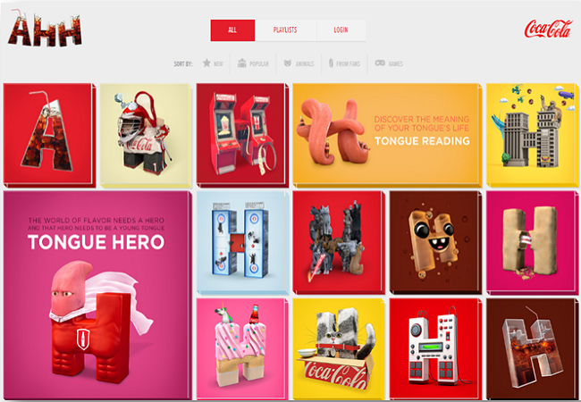
The Super-fun AHH campaign by Coca Cola:
And there are more like Flipboard, Burberry, etc…
The innovations: Designers will continue with cards, related transitions/effects, and trying to adapt the same design’s minutiae with both mobile and the desktop.
Which brings me to my next point…
• Hamburger Navigation
The principle: What began as an effective way to kill two birds with one stone (mobile navigation and simplifying complex navigation) isn’t the attic where you stuff the things you don’t want to deal with. Hamburger icon has created as many problems as it has solved.
The Shift in perception: As more designers take the stand for usability of the websites and follow the research results, Hamburger finds itself being used in newer and better ways than before.
Check out the examples here:
Apple hides the Primary (main categories) products navigation in the hamburger and shows the products under a single category (Mac) as tabs:
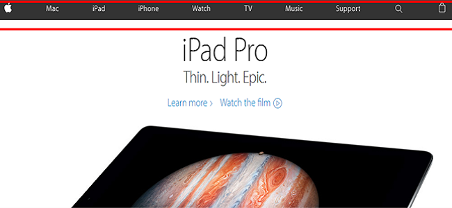
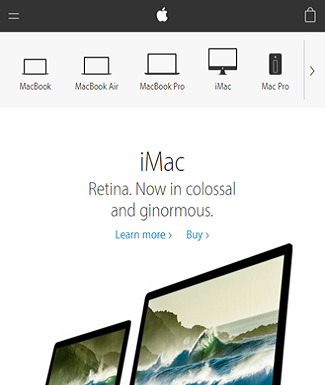
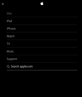
Imagine the majority of people who use Apple products today and whether this is too difficult for them to figure out. The design is fluid and maintains consistency: The hamburger only appears when the viewport is too small to display main navigation.
Now compare that with Boston Globe:
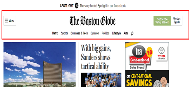
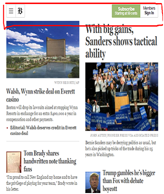
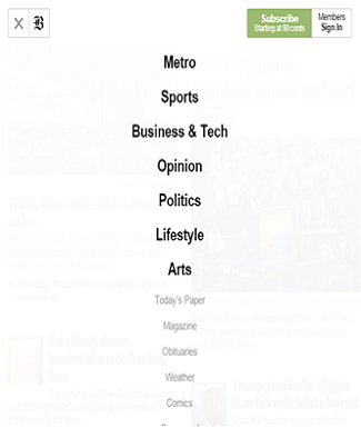
I have two issues with navigation here:
1. When the main navigation is on the desktop page, what’s the point of a hamburger here?
2. Why is the hamburger even more complicated for the mobile users with greyed out subcategories listed below the main ones?
There are other websites guilty of this ‘misuse’ of hamburger, some in WordPress showcase itself (culprit: BBC America). As a member of WordPress community, I remember the outrage against Hamburger (most of it from me). But the icon is here to stay.
That doesn’t mean we lost though.
The innovations: Instead of just rampantly adding a ‘three-stacked-horizontal-lines’ button to the every website for every kind of navigation, designers are paying more attention to the context and the audiences. Essentially, hamburger icon is here to stay, but UX won the war.
• Microinteractions:
The principle: Microinteractions aim to make human-computer interface as human-friendly as possible by replicating the ways people are used to communicating with day-to-day objects in real life.
The Shift in perception: Human-centred design approach is rapidly gaining ground with web designers. In turn, the practices entailed in this design approach themselves are being refined and used in better ways.
This is the perfect time for web-designers to get behind micro-interactions as The most perfect way to improve cognizance and comprehension of even the most seemingly boring websites’ interfaces. Essentially, using small, recognizable animations are a way to bring interfaces to life.
You may have seen this before:
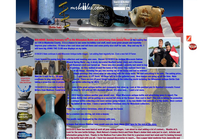
This picture has done more than its fair share (okay, maybe it’s fair) of rounds on various lists all having the words “Worst Website Designs EVER”.
Look at the remodel:
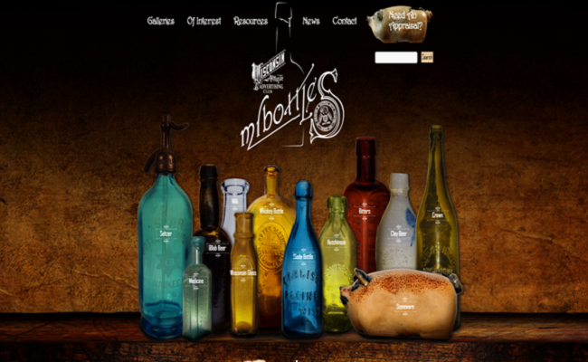
In case you’re wondering: it loads fast, it’s beautifully realistic, and it uses microinteractions (hover over every bottle, the logo inside ‘S’ curve keeps moving).
The innovations: As far as usability and experience goes, nothing beats realism. Try incorporating some of it in your designs to make it stand out in a sea of ‘savants’ all wrapped up in Flats.
• Conversion-driven design
This is what everything will come right down to.
With growing focus on online marketing and conversions, it was only a matter of time till UX entered the fray and conversion became a design goal.
As long as you stick to the UX practices that are best for you, test with discrimination, and keep improving, you are along the right track.
Last Bit of Advice:
Don’t get stuck on a best-practices rut or follow anything to the letter. Even the Bible says, “Do you see a man who is wise in his own eyes? There is more hope for a fool than for him.”
Don’t be a learned-idiot. Test, and improve: and take every bit of advice here as possibilities and not law.
Tracey Jones
Tracey Jones is a web development professional and well-known writer. Presently, she works for HireWPGeeks Ltd. where she assists her clients to hire WordPress experts in order to customize their WordPress site. When she is not developing websites, she loves to write excellent tutorials about WordPress and new web design technologies.


What are some churches that are doing this well? We employ both the slider and the cards on our page, but I’d love to see some other examples we can learn from.
The hamburger menu is one I now incorporate on all sites. WordPress has a few hamburger navigation plugins that are easy to install. If you buy the premium version you can control more elements in your header as well.
Yes. You can hate on it as much as you like, but the truth of the matter is, the longer we use it the more people will understand it.