Email newsletters are a great way to get the news out about an important event and also deepen your connections with someone. Seeing as email is still one of the most likely ways to make sure that you contact everyone that you need to contact (and not just a small selection as you would from a Facebook update) getting email right is important.
And that’s why you should be A/B testing you’re emails.
We’ve been doing it for a while with the ChurchMag newsletter and here are some lessons that we’ve learned.
What is A/B Testing?
A/B testing is a way to find out what is more effective between two simple options. Basically you create two versions (creatively called version A and version B) and compare which is more successful. This lets you work out what copy is more effective, or what title appeals to people more.
In the past, with physically dominated market places, this was more difficult as you’d have to create two different versions of the same product to test. With webpages and tracking tools, it’s much easier to test.
How Can You A/B Test in MailChimp?
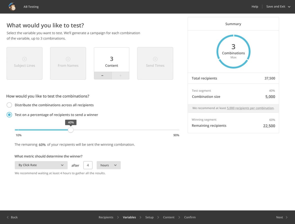
MailChimp has A/B testing built in as a pro feature (so you need to pay at least $10 a month, as you would if you had more than 1000 users) on your list. This let’s you create A/B campaigns where you can test a few factors (yup, you can have three variations in your A/B test…go figure…A/B/C?). All you need to do is create a new campaign and instead of clicking “regular campaign” (or whatever option you normally choose) click “A/B testing campaign.”
You can now select one of four variables to choose from including:
- Subject Line
- From Name
- Content
- Send Time
11 A/B Test Experiments You Should Try
Almost every week we have run an A/B test of some sort for the past 4 months. This has helped us to try to work out what makes the newsletter better.
Of course, this isn’t an exact science since our weekly email newsletter doesn’t have thousands of subscribers so the results aren’t “statistically significant” and there might be some sub sections of the readership who prefer different options.
Here are some ideas for you to try:
1. Short content vs longer content.
Do readers prefer short 1 paragraph emails, or longer posts.
2. Different images.
Try using different images and see what resonates with readers more.
3. Links vs buttons.
Do people click more on hypertext links or buttons?
4. The order of your content.
Do people prefer prayer requests before bulletins or after?
5. No images vs with images.
Images take up load time but make things more attractive. What works better?
6. Plain text vs HTML.
HTML emails look pretty, but plain text looks more personal. Which is better for you? (P.S. MailChimp doesn’t let you test this yet.)
7. Personal from name/professional.
Is “Chris” better than “Chris at ChurchMag” or “ChurchMag”?
8. Short subject line vs long subject line.
Do short subject lines work better than long ones?
9. Subject line with Emoji vs without.
What about emojis in the subject line?
10. GIFs or no GIFs (that is the question).
Everyone loves GIFs right? Oh…not everyone does apparently.
11. Funny preview content vs summary.
You know that little preview text? Well it’s what people can see in their inbox. Should you make it funny, a summary or something else?
5 Personal Discoveries

Here are some personal things we’ve learned with the newsletter:
1. Friday is our best day to send our email.
Friday has far greater open rates than Saturdays and Sundays. Sunday is our worst day and I get lots of auto responses saying “I’m out of office right now”. Friday get’s better open and click rate.
2. People want to know its from ChurchMag.
We tried a few combinations but “[ChurchMag Weekly Insider] (persons name)” seems to be the best for us. I liked “Chris at ChurchMag” But that can get cut off. Starting with the organisation first let’s people know who.
3. Shorter content is better.
One paragraph intro seems the best for us, well we get more clicks at least.
4. Buttons are better than links.
We use buttons sparingly, but often for big calls to action like “Listen” or “download”. These get more clicks than when we use links for those actions.
5. Too many links can be bad.
We reduced the number of suggested content items we had as “the paradox of choice” seemed to overwhelm people. Still, the point is that this is a roundup so we want (and need) to give people options. It’s a tough balance to strike.
A Word of Warning
Please bear in mind that MailChimp views things from the perspective of a shop selling a product and so the most important metric to them are clicks on links (it’s also easy to measure). As such, just because someone may have read your content and really engaged (i.e. prayed/turned up to your event in public). If you don’t have a click, MailChimp can’t see that was more significant.
Also our A/B tests may show different results than yours depending on what you use your newsletters for and what your readers are into.
Have you learned anything from A/B testing?
I’d love to know what you’ve experimented with so we can try out some more experiments as well. Plus it might help other people out there.
Oh! Would you like to have ChurchMag in your inbox?
Chris Wilson
I'm a Copywriter and content marketer based in Krakow, Poland. I enjoy sketchnoting in my free time and have some free sketchnote courses if you want to start.


Speak your mind...