![The 10 Commandments of Color Theory [Infographic]](https://churchm.ag/wp-content/uploads/2014/06/Cool-colorful-lights.jpg)
Do you see the pretty colors?
Mixing and matching a color palette sounds like it’s easy, but for most of us, it isn’t.
Personally speaking, I know a good design when I see it, but creating it on my own? That’s hard.
It’s infograpics like this that have really help me understand what I see as good design and replicate it in my own work. I hope this helps:
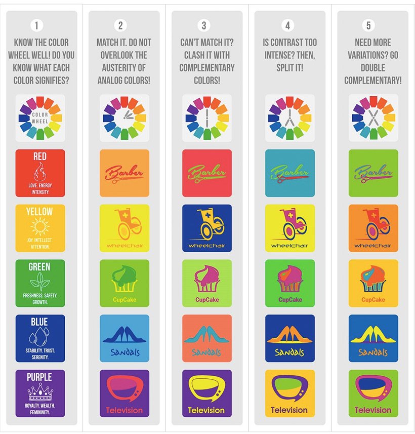
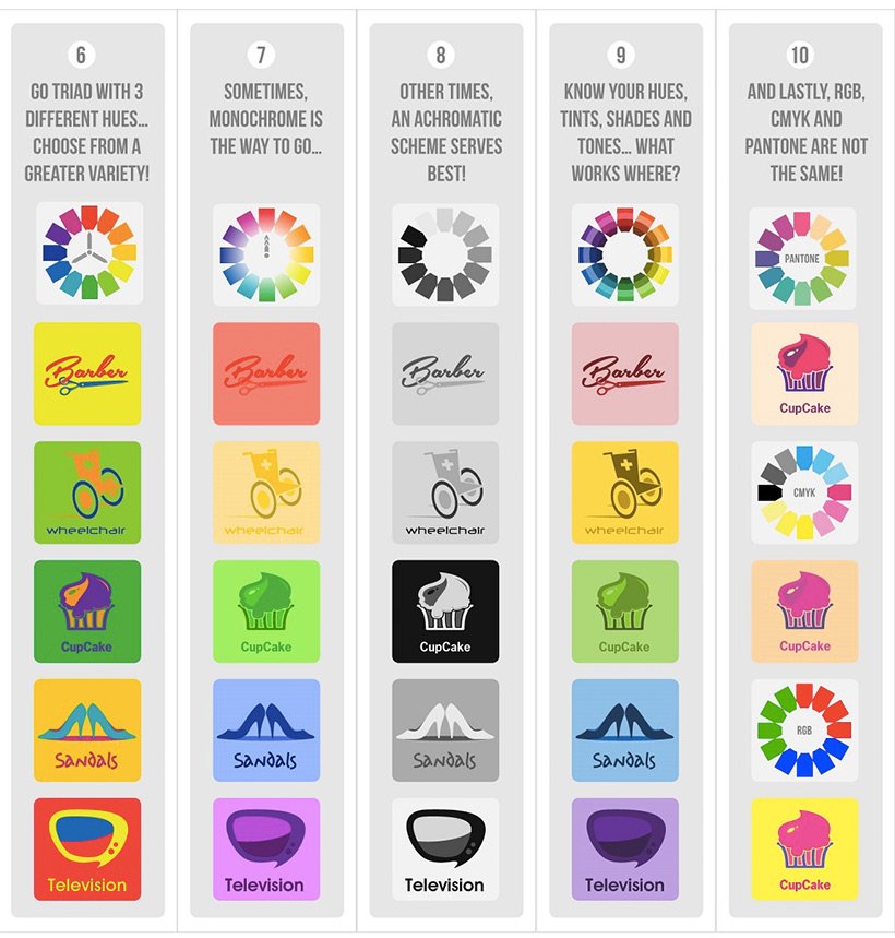
Interesting, isn’t it?
I’ve got my preferences with some of the concepts outlined here, but all in all, I can clearly see and understand the color theory behind these that makes them work.
[via InspiredMag | Image via glee13 via Compfight cc]
Eric Dye
Support Lead at Valet, and Proprietor of DYECASTING. Human by day, gamer at night, lover of coffee, and all things spicy.


Speak your mind...