Responsive web design. Have you ever heard of it? All the kids are doing it.
It makes a lot of sense, too.
The user experience from a smartphone, tablet, standard monitor, or widescreen monitor, is going to be considerably different.
Responsive Web design is the approach that suggests that design and development should respond to the user’s behavior and environment based on screen size, platform and orientation.
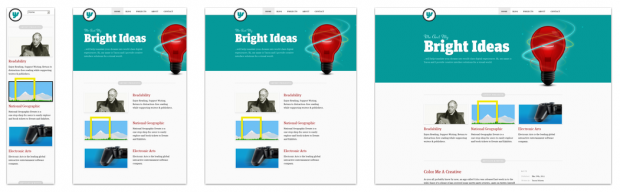
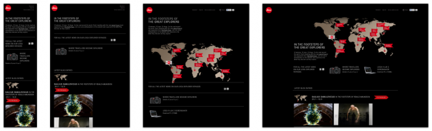
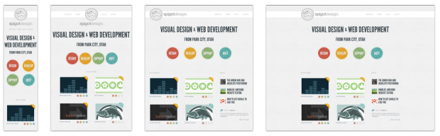
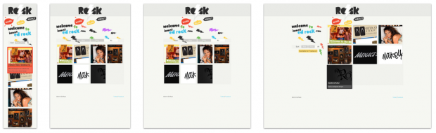
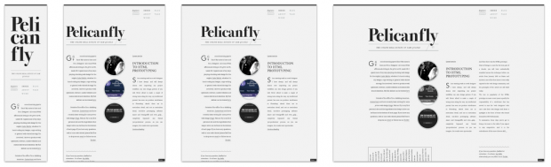
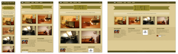

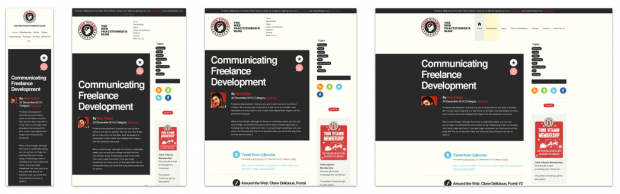
For more responsive web design inspiration, scroll through the full collection at Media Queries.
To learn more about responsive web design and how to use it, read this great article by Smashing Magazine.
[via Media Queries]
Eric Dye
Support Lead at Valet, and Proprietor of DYECASTING. Human by day, gamer at night, lover of coffee, and all things spicy.


Love this type of creativity, it fulls me!
Two thumbs up!
🙂
If your web design isn’t responsive you’re going to be hard up in the coming years.
It’s true.
Corporate Video Production Company in Bangalore and Explainer, Animation Video Maker in Chennai
Interesting post its really very useful for us.