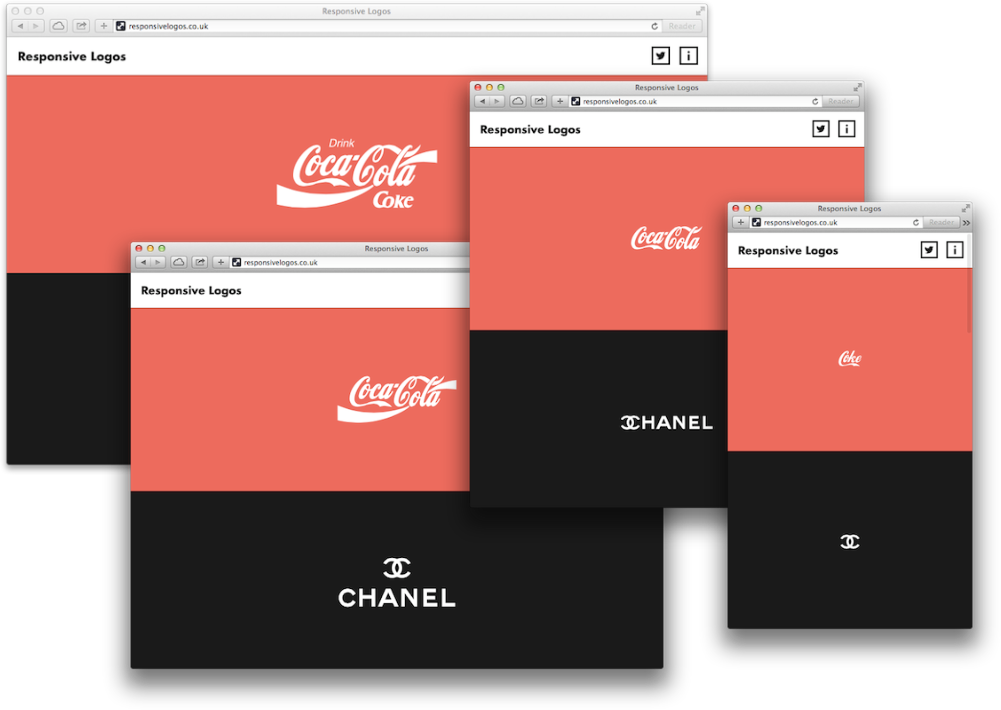
Joe Harrison has put together a really cool experiment with responsive logo design.
He has taken the basic principles of responsive web design—making websites look awesome on all mobile devices and computers—and applied that to popular logos.
The result is awesome:
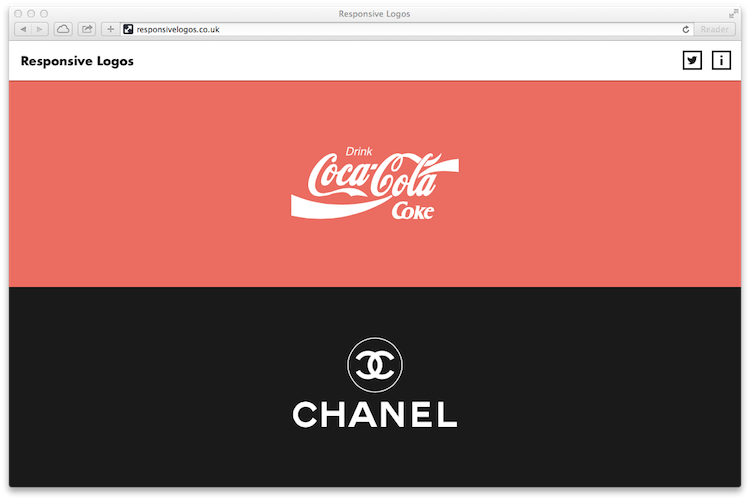
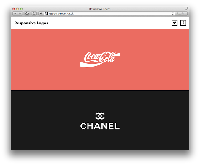
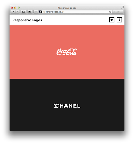
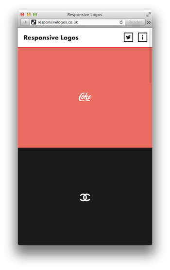
As you can see, the smaller the screen becomes, the smaller the logo becomes. But this isn’t just taking a basic logo and shrinking it, the design itself transforms, making it look its best no matter the size.
Instead of looking at this with these screenshots, visit Joe’s website to see multiple logos transform based on how you’ve scalled the web browser.
Look at these awesome responsive logos!
Your next church logo may need some other variations.
Eric Dye
Support Lead at Valet, and Proprietor of DYECASTING. Human by day, gamer at night, lover of coffee, and all things spicy.


Speak your mind...