Superman, Star Wars, Batman and more!
[This is part 4 of a 10 part series titled: “So You’re An IT Noob“]
In the previous entry, we discussed how to get your church up and running with an Internet connection. In this part, we’ll be looking at being able to share that connection with your staff/volunteers with a network.
In a later post, I am going to delve into the world of Cat-5 cable, routers, switches, and other aspects of a wired LAN, but for this entry we’ll assume you’re going to go wireless.
Thankfully, wireless Internet access is not something determine by what platform you’re running. A computer running Windows, Apple OS, Linux etc can all connect to the same wireless router. So this begs the next question:
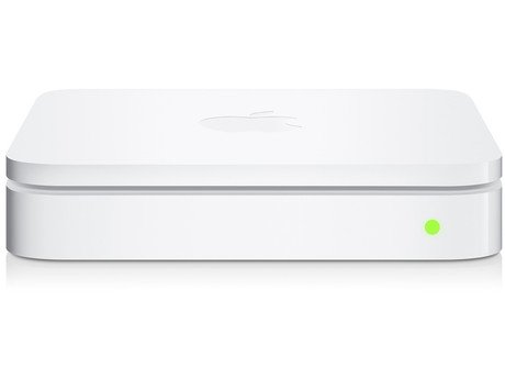
Which wireless router should I get?
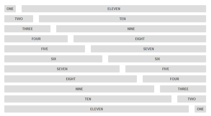
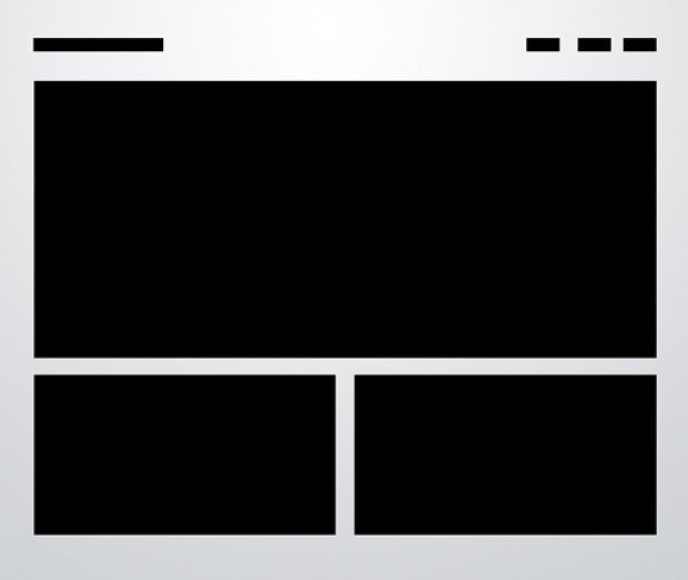
Yesterday, we posted about the Responsive, Mobile-Friendly Development Boilerplate called, Skeleton. A very nice responsive framework to build on. We also showed you 10 Solid Web Layouts, a summary of the ten basic layouts used in web design, today. A great page to bookmark for future use for sure! Today, I’ll share with you the code for three of the ten solid web layouts discussed, built on the Skeleton framework. Another great piece by the Design Shack’s Joshua Johnson.
[Read more…] about How To: 3 Solid, Responsive, Mobile-Friendly Layouts

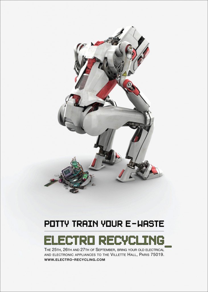
Here’s a barrel of creative ads that should get your creative juices flowing!
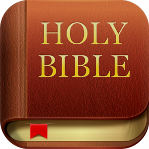
The newest release of the YouVersion Bible App, 3.2, is now available for the iOS!
They’ve made several improvements, so if you already enjoy YouVersion, be sure to update; and if you don’t, now’s the time to give it a try.
Here are some of the improvements and tweaks for version 3.2:

Response web design seems to be the direction of the web design community, as programming for multiple devices – desktop, table, smartphone – requires so many unique sizes. With a responsive design, your website flexes to the screen size it’s being rendered on.
Skeleton does just that.
It’s a responsive boilerplate based on the 960 grid system, with a small set of CSS & JS files that can help you rapidly develop sites that look beautiful on a 17″ screen or an iPhone.
Skeleton is built on three core principles:
[Read more…] about Responsive, Mobile-Friendly Development Boilerplate


