Responsive web design has become essential.
With so many different sized devices cruising the web, your design has to be responsive.
Sometimes designing a responsive site can be tricky, but thanks to a new online tool called, FROONT, you can visually design a responsive website straight from your browser!
FROONT
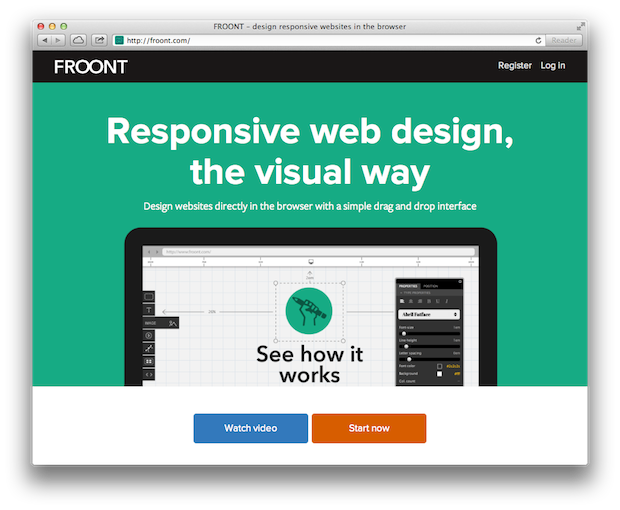
FROONT allows you to design for all screen sizes, all at the same time, as it allows you to see what users will see.
You can even share designs by sending URL’s to team members and clients!
Here’s FRONT in action:
[tentblogger-vimeo 60153687]
[tentblogger-vimeo 63723477]
Pretty cool stuff.
Is this a tool you would use?
Learn more on the FROONT website.
Eric Dye
Support Lead at Valet, and Proprietor of DYECASTING. Human by day, gamer at night, lover of coffee, and all things spicy.


Thank you for this post. I thought I knew all the tools that are out there, but did not know about this before!
😀