
I recently finished reading the book Deep and Wide by Andy Stanley. The main premise of his book is about “Creating Churches Unchurched People Love to Attend”, which just happens to be his tagline for the book. After reading it, I was really challenged to see how we could relate that to our church websites.
What would it look like if we designed our Church websites for the unchurched?
In my experience, there are two groups of people that will ever visit your church website. The first group are those looking for a calendar or the most recent sermons. They’ll want to keep up to date with whats going on, and catch those sermons if they missed them the previous week. (That is if they don’t already have them automatically downloaded through iTunes or a similar service.)
The second group are those who have never been to your church before. They are merely researching churches in their area to go visit. They are looking for resources like directions, service times, and what groups that the church offers. Or it could be that they were invited by a friend, and they wanted to check it out before they actually went to the church.
These are the people we should be targeting with our website. The reality is, most current church members will be content with however you structure the site. They’ll hunt through pages looking for the information they need. For a newcomer though, they will have much less patience than those church members I just mentioned.
Here is a practical example. Since I mentioned Andy Stanley earlier, let’s look at his church’s website. I feel like they’ve produced a great example of a web site that targets the unchurched first. In the image below, you can see the first three buttons that stand out.
- I’m New
- Engage With Us
- Watch Messages
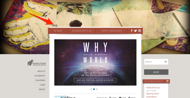
These menu buttons are useful for both church goers and newcomers alike. As someone who has never been to Northpoint before, I’m immediately drawn to these items. It makes it easy for me to learn more about the church without it being cumbersome for me. As church web developers, we want to make it as easy as possible to get people in and connected. We should be taking every step we can to make our church websites visually pleasing and easy for those who are looking for a church home.
Remember, we only have one chance for a first impression.
What methods have you intentionally implemented in your Church’s website to target the unchurched?
[Image via B Rosen via Compfight cc]
Casey Dierking
I'm a Southerner turned Midwesterner, Family Man, and Media Director at The Bridge Church in Ottumwa, IA. I love writing about the things I'm passionate about which include design, video, and web.


Less is more.
By not having the bio of the church secretary, you emphasis the meeting times and directions.
By not having the list of deacons/board, you emphasis the mission statement that is shown./
Fewer links. Fewer long lists of sermons. Fewer lists of archaic terms; save that for the intro “class”
If we have to make it easy for the long time attender or for the new person – it’s the new family.
Less is more! Amen!
On top of our website we have a bar with the main service times, the church’s address and the contact email. We also highlight a lot our vision, our current sermon series and the main characteristics of our church.
Another thing we’ve pushed into every page of our site is that somewhere you will find a button to connect in someway. In almost every page.
Btw, D&W is an awesome book. A must read for any church leader. As you said, it challenges us into rethinking our approach.
It’s exactly those things that turn me off when visiting church websites. Just shows you can’t please everyone.
If you dont’ mind posting it, could you post the link? I’d love to see how you guys execute the bar on top. I think learning and sharing with each other is the best way we can learn and grow together as church techs.
No problem! I work for a church know Chile so everything is in Spanish, but I think you’ll get the idea. We are using the Avada Theme for WordPress. http://www.iglesiajuvenil.net
And that my friend, is the power of google translate. 🙂 I like the bar up top! It has all the vital information you need right at your fingertips.
This is stellar (the comments, too).
Casey – I love this! I think what is missing from almost every church website I visit are the stories of real people within the congregation. That’s what’s going to resonate with those who aren’t interested in our service times, the names of pastors, etc. You might be interested in this article I wrote a long time ago (it’s outdated in some ways, such as the reference to VCRs!) and the blog is mostly dormant, but I think the principles are still valid – Effective Church Websites For Emerging Generations. Thanks again for a thought-provoking article!
Frank, thanks for the comment! I agree with you. We really want things to resonate when people go to our sites. I’ll definitely check out the post you wrote.