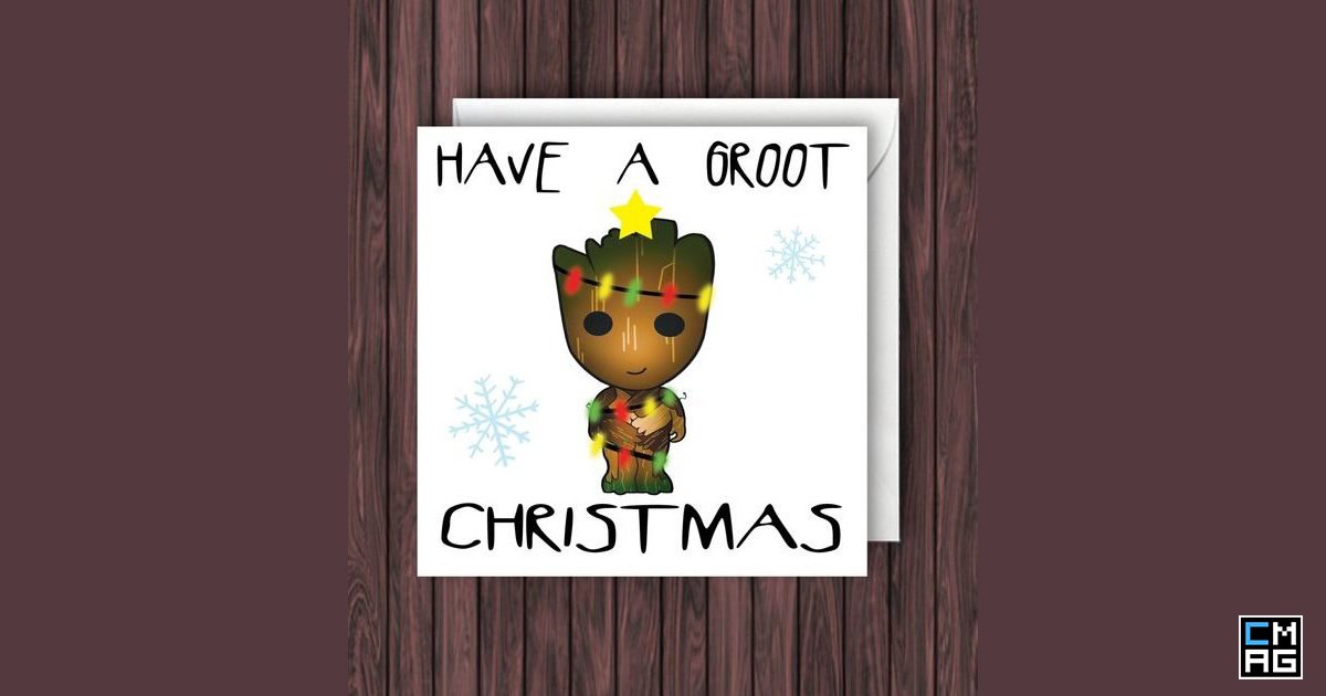
Merry Christmas from all of us at ChurchMag!
We have these Avengers Christmas cards as our virtual Christmas cards to all of you. Please accept them in all their geeky glory.
[Read more…] about Merry Christmas: Avengers Christmas Cards!
The #1 Resource for Church Technology Creativity & New Thinking
Merry Christmas from all of us at ChurchMag!
We have these Avengers Christmas cards as our virtual Christmas cards to all of you. Please accept them in all their geeky glory.
[Read more…] about Merry Christmas: Avengers Christmas Cards!
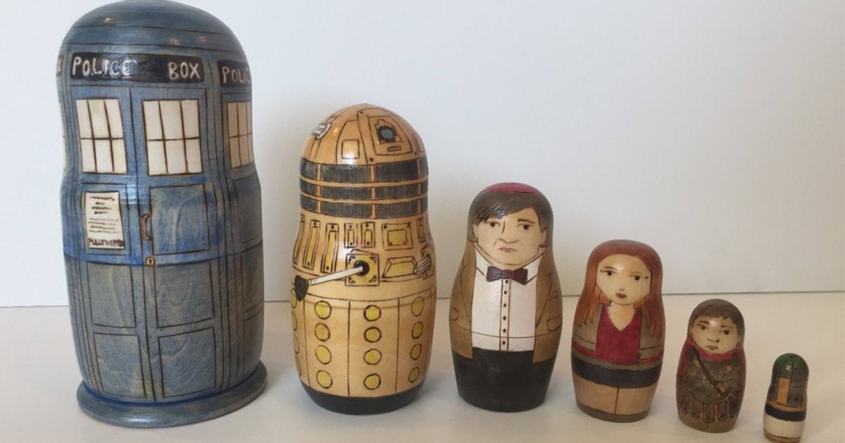
I love Nesting Dolls (insert Nacho Libre scene here) and these are some of the geekiest ones I have ever seen, and they are even handmade.
They are from all over the universe; from Doctor Who and Companions to the Guardians of the Galaxy, with Marvel, DC, and Star Wars heroes and villains in-between.
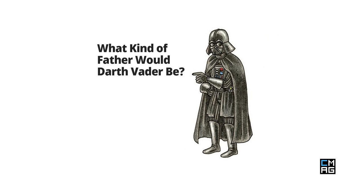
What if Darth Vader did not lose contact with his children? More specifically, how would he have dealt with the teenage drama of raising Leia?
Well, you don’t have to imagine it because this comic shows us their thoughts on how Vader would be. Interesting, this is actually a children’s book called Vader’s Little Princess by Jeffrey Brown.
What other situations could you see depicted in this relationship in the book?
[Read more…] about What Kind of Father Would Darth Vader Be? [Comic]
I am a huge fan of Lord Of The Rings, but who isn’t? I also love seeing fan-art because you get something so unique and creative, inspired by something everyone already loves.
These Lord Of The Rings Location Prints are simple, tasteful, minimalistic, and portray in earthy-tones; Rivendell, The Shire, Rohan, and Mordor– just perfect for any LOTR fan.
[Read more…] about Lord Of The Rings Location Prints [Images]
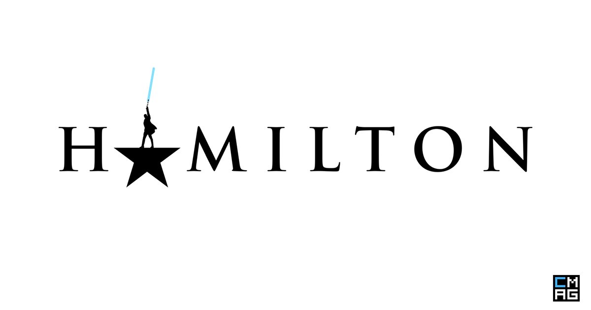
If you are a fan of Star Wars and Hamilton: An American Musical, then the chances are that you will love #force4ham– I know I do! It’s two fandoms colliding on a colossal level, it’s Hamill-ton.
I go on Twitter every now and then to check on the #force4ham hashtag and this last time I decided to screen capture some of my all-time faves and share them with all of you. This hashtag never ceases to bring me enjoyment.
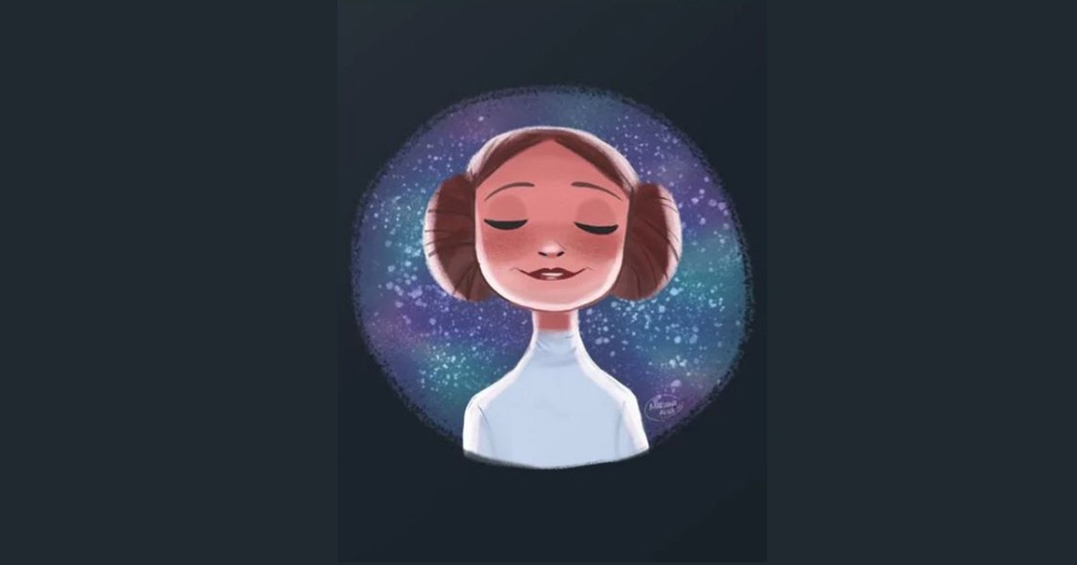
Mariana Avila is an illustrator and animation student from Monterey, Mexico. Her art is not only over-the-top cute but also, geeky; from Marvel Avengers to Star Wars to DC Superheroes, she has absolutely lovable prints of everyone’s most favorite heroes in her own adorable art style. And all of her prints are not only available as posters, but also as throw pillows, coffee mugs, phone cases, t-shirts, and lots of other things which you can check out and buy here.
[Read more…] about Geek Meets Art, Meets Awesome: Mariana Avila