
Since acquiring ChurchMag at the beginning of this year, I’ve been doing a lot of thinking about its future.
From the logo to the community itself, I’m brewing-up all sorts of different ideas.
A few things have begun to surface and I’m not afraid to try some things at the risk of failure. The failure of the ideas, of course, not ChurchMag itself.
Here are some areas of ChurchMag I still have yet to resolve and would love to share my thoughts with you all.
Design
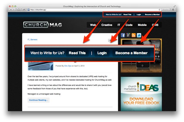
Ever since I became Editor of ChurchMag over two years ago, I’ve had at least a dozen emails from people inquiring about the “Become a Member” link at the top of the screen. I had asked the 8BIT guys about it, but never got a firm answer. This is only one of the many changes I would like to make to the ChurchMag design.
Here are some others:
- Logo
- Layout
- Navigation
- Author pages
These are just some of the changes of the top of my head.
Logo
I’ve wrestled with the logo idea, as the “battery” look is reminiscent of The 8BIT Network and 8BIT’s old logo (for those that don’t know, 8BIT started The 8BIT Network which evolved into ChurchMag). There is a lot of talent in the ChurchMag community, so I would be interested to see some ideas.
If you got to design the ChurchMag logo, what would it look like?
Layout
The layout of ChurchMag is feeling very cramped and old to me. Plus, it’s still running on 8BIT’s WordPress theme, Standard 2. The next design of ChurchMag will run on Standard 3, making it fully responsive for mobile viewing. Something that we preach on ChurchMag, but not doing ourself! *GASP*
If you got to design the ChurchMag layout, what would done differently?
Navigation
ChurchMag has a butt-load of categories. In fact, not all of them are currently supported in the drop-down. When The 8BIT Network was drawn together into ChurchMag, each site (six total) became it’s own category, while each site’s categories became sub-categories. Yikes! Now, I’m not considering re-categorizing 11,000 blog posts, but I would be interested in any awesome ideas on how to best navigate through.
How do you navigate ChurchMag? Any insights you would like to share?
Author Pages
I would love to develop an area for ChurchMag’s regular authors. A place for a bio, some links and some awesome stuff thrown in. We have had a number of committed authors over the past years, and I think they should get some real estate around here.
Do you agree?
Feedback
I would love to get some feedback on this stuff.
There’s no such thing as a “bad idea” at this stage, so speak freely.
Now, let’s hear it!
[You can email me images at eric [at] churchm.ag]
Eric Dye
Support Lead at Valet, and Proprietor of DYECASTING. Human by day, gamer at night, lover of coffee, and all things spicy.


I like the author page idea (which reminds me I need to write more). I don’t see the point of the “become a member” link either. A newsletter signup might be a good idea, too.
Paul
Agreed!
Author Pages would be sick!
Also pretty easy to do. https://churchm.ag/author/ericdye/
Yeah. I’m also thinking about highlighting are regulars–full bio with picture, etc … 😀
I’m excited to see what you come up with next! Let me know if I can contribute in any way.
I’m open to seeing ANY logo ideas. 🙂
Sure! I will work on some concepts 🙂
Cool! 😀
Eric,
I’m excited to see what you come up with…
Here are my 2 cents for what its worth:
Logo: I would love it if it had something to do more with the site and with church. The current logo just doesn’t do it for me and frankly doesn’t really make too much sense, what does church tech have to do with a duracell AA battery?
Layout: Standard 3 is a bit better, I wish there were a better way to search the site. I find myself wanting to go back into the depths of the archive on church mag, but get frustrated after a few searches on the site give me random bits of info I didn’t need.
I also hate scrolling! For some reason standard 2 seems like the font is huge and makes me scroll a lot. (just a personal problem for me I think)
Navigation/Categories: I know when I’m finished writing an article, I never really know what is best for the category. There are WAY too many to choose from, and too many choices is not great for me! I wish there were say 7-10 simple categories, not sure of what those would be…but happy to give my input later.
Author Pages: This is a great idea, now that I’m a new writer to the blog, I love learning about what the other writers on the blog are up to!
I wish the comment section were easier to read and looked better…not sure what Standard 3 has but I really like the feel and look of this site: http://www.churchstagedesignideas.com/
same type of look, but really easy to find what I’m looking for when I need it!
Hope this helps! Thanks for all you do!
Really good feedback. Thank you Seth!
I definitely agree the whole site needs to be re-imagined. The name is even somewhat confusing – to me at least. ChurchMag sounds like a website for a magazine called “Church”. If I was new I would wonder where the magazine is.
As far as look – I love the new digg.com. So clean and simple – the content jumps right out. Not sure if Standard Theme 3 could even do that.
Logo – something simple here as well. I don’t think you necessarily need icons and a lot of graphics, etc. Sometimes a good font will do the trick.
Authors page is nice.
A resources page would be sweet. Categorized by type. Apps, Books, Music, Audio Equipment, Video Production, Lighting Equipment, Tech…The list goes on. All of these would be related to the church and those who work for the church. Any time a blog is posted with a resource you automatically add it to the resources page. There would also be a link back to the post from the resource page as well. I’m sure you could monetize the mess out of this with “recommended products” in each section. This may be WAY outside the purpose of church mag but something like this is very much needed for church staff. It would be a ton of ongoing work as well i’m sure. An easier way would to just do a monthly resources post. Compile a list of all the resources mentioned on the site that month and wham-o your done.
Hope all that makes sense. Kind of rambled on. 🙂
Love it! Thank you, Brandon! 😀
I dig Digg, too.
I’m all for a major overhaul of the site 🙂 I agree with others that the logo should be redone and that a ‘Christian’ component would be really good. Something that combines Christian and tech. I’m not a designer so I can;t help you out there but like with many other things: I know it when I see it 🙂
Author page: yes please. As a regular contributor, I’d really appreciate this. Integration with Google’s Author Markup would be great so we can ‘claim’ what we’ve written as our stuff and gain some credibility.
Number of categories: couldn’t agree more, there are way too many and of some I don’t even know what they mean.
To me, the site also feels full and kinda stuffed. A cleaner look would be good, maybe also with some less depressing colors? The black kind of depresses me after looking at it a while, just sayin’ 🙂 Also, I know you need the ads for income but there are a lot and they are all over the place. Maybe tone them down a bit?
Hope that helps!
More great feedback, thank you Rachel!!!!
While I agree with the majority of what is said besides the logo ideas.
I would stay away from the “christian” logo as it will only come out cheesy. You don’t want that. This is a serious site about the intersection between tech and church, but it doesn’t have to include something “christian” to tell new users what the site it all about!
I have the same feelings about it. I don’t foresee any “fishes” or anything like that. 😛
Logo – I have enjoyed the branding of the site for so long which gives testament to the stregth of the brand and the logo. If there’s gonna be a new logo work from a brand position first otherwise you may just end up with something pretty. It would also be nice to remeber the roots of the site and its history.
I agree with Matthew. Going explicitly Christian risks a high cheese factor unless it’s done well. Keeping things simple is always the way to go.
Nav – Simplify! It’s be said before – categoreis are too many and too diverse. Due to the nature of this site I think that will always be an issue as cats will grow and flex with new technologies. It’d probably worth putting in some thinking to a review procewss every few months on the categoris and their structure. That said – beware of killing all the cats as there may be some sites linking to the cats that get nuked. There may also be people subnscribed to certain cat feeds.
Layout – Looking forward to a new theme and Standard 3 will look beautiful. I’m especially lookin foreard to the responsiveness. I’d take care with what you do with it in customisation.
Kokatu changed their site and now it has no navigation whatsoever making it a painful experience to use. I now never visit the site and only read content through Feedly. It’s a really bad example of over-simplifying a design at the cost of usability.
Masonry layouts are very popular atm but they only really work best on tablets. On desktop machines masonry styles are not as ergonomic to use.
Authors – WOuld be nice to see author pages with their contact details and their posts.
Really looking forward to what gets done!
Dude. Seriously. Glad you added your input, here. Thank you. 🙂
How about using hashtags for organizing posts? #navigation
Hey, that’s a cool idea! Perhaps the introduction of Tags is in order …
Yeah, tags help to make content more discoverable.
I’ll also be honest and say that I think WordPress is holding the site back. You’ll never get away from the fact that WP is a blog, and even plugins are restricted by that. What do you want, a blog or a community? What do you want to do with your community?
I know you’ve invested time and effort into WP, and I know that you love your commercial themes, but don’t let yourself be limited by it. If you do, you’ll never know what might have been possible.
As a possible alternative, Drupal is WAY more flexible than WP.
Thanks for the feedback, Raoul!
This post is older, but I’m jumping in anyway. As someone who really hadn’t had any past experience with ChurchMag or 8bit, I was definitely thrown off by the logo—not in a great way. If it really is a battery (which is what I thought), I didn’t get it. And it took some browsing through the site to figure out what it was all about.
So I think a logo redesign is a clear place you could improve things. So the question is, what’s a visual representation for “tech?” that is instantly identifiable, really forward, and yet will last longer than a year?
Related is this: with “Mag” being a rather generic 2nd word of a title, the name “Church Mag” itself doesn’t do all the brand work: if I explain it to others, they don’t get it with just the title (It’s a magazine about the church?). You might not be ready to make a change to the name, but a subtitle or tagline in the header and consistently with the brand might really help. “Tech with a purpose” or “Tech & Church” or “Christian geeks welcome” or something.
These are great thoughts, Chris, and as you see that we haven’t produced a new logo, yet, I appreciate all feedback! I really like that you’re insight comes from someone who doesn’t know the history. Great stuff–love it!
Thank you.
🙂