Designing documents is a ton of fun…when it’s serving as a distraction from blogging. But when your church switches computer platforms from PC to Mac, document design becomes your new job.
Sigh. Welcome to my world over the past few weeks.
But just because I spent my Christmas break designing doesn’t mean that you need to spend your January the same. Over the next few weeks, I’m going to giveaway three design templates:
- a newsletter/bulletin,
- a connection card,
- and a guest card.
Now, as a disclaimer, let me say that I’m not one of the world’s top designers, but then again, they are free.
This week, I’ll be releasing our newsletter template, but let me first explain some of the thoughts behind the design so you understand why I emphasized some things over others.
The ‘Why’ Behind the ‘What’
I’m not the best designer, which I hope I’ve made abundantly clear, but I do feel like one of my strengths is asking good questions before I dive into a major project. I try to let the answers to these questions guide me. That being said, let’s look at each page of the newsletter.
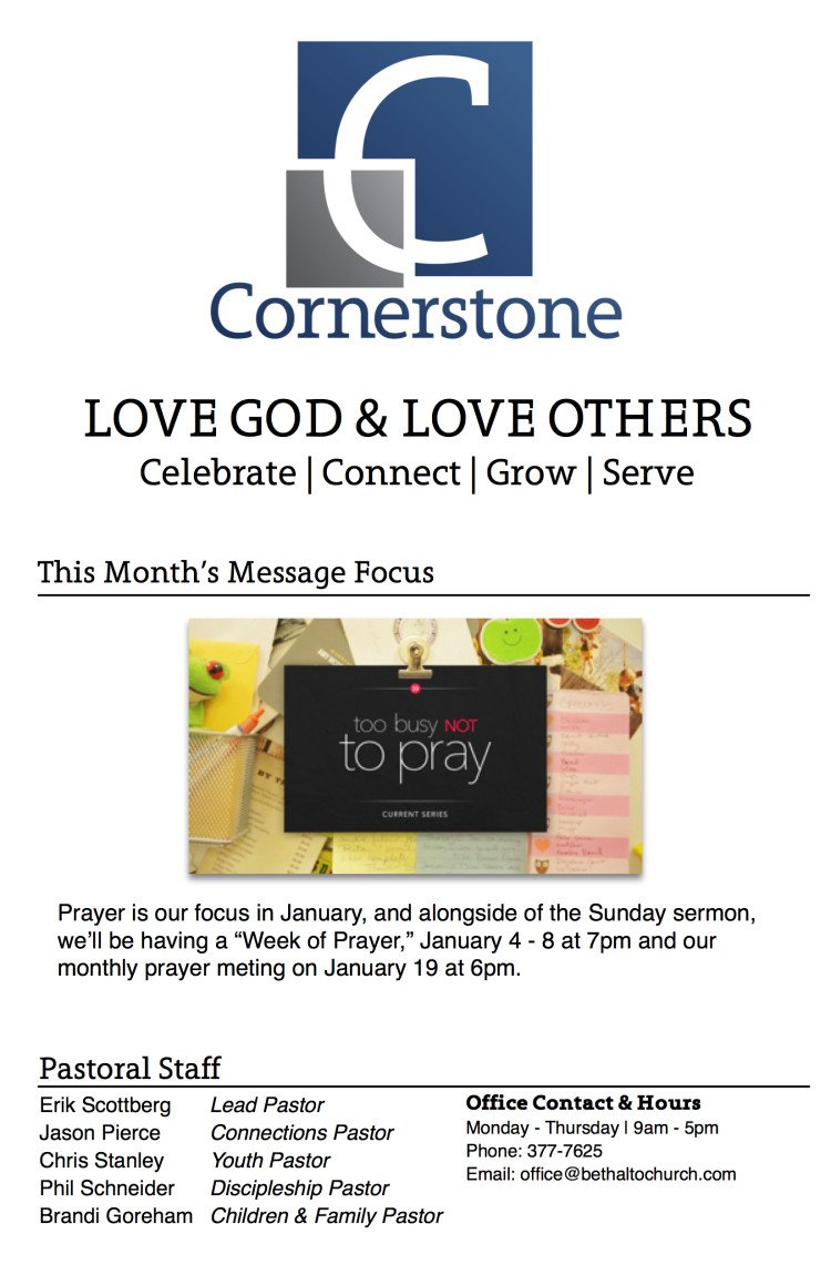
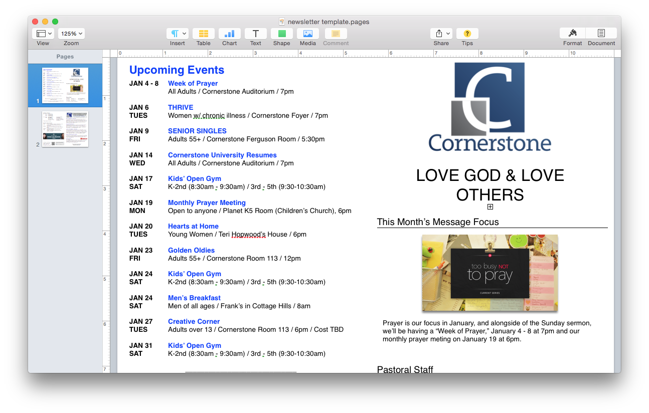
Front Cover
The first thing I’d like to say about the cover is that I’m not happy about it. It’s a compromise between what my lead wanted and what we could do with our current logo, which we do want to change. That aside, our cover’s focus is the sermon series. Why that and not a devotional or note from the the pastor, which we used to have? Because we want our (monthly) newsletter to serve as a guide to what’s going on, not just on the calendar, but in the service, as well.
You see, our newsletter has two audiences: an inconsistent primary audience and a consistent secondary audience.
The primary audience is our guests. These individuals are always there, though it’s not always the same individuals each week, which is why they are “inconsistent.” Why make guests our primary concern? Because they are the ones who have no idea what’s going on. They need the newsletter more than regular attenders, our consistent secondary audience, because they should have at least a basic idea of what each Sunday service holds. That’s why we’ve placed our motto and values on the top of the cover, which should hopefully tell our guests, at a glance, what we’re all about. The message focus is in the center of the cover so that it catches the eye. Looking back now, I would have titled this section “January Message Focus” because I just realized that I didn’t put the month anywhere on the cover. Editing, you’re never done.
I put the staff and contact information at the bottom and made it as small as it is to provide some sort of balance between wanting guests to know our names in case they miss it when we do the intro or stand up to speak and not wanting to make us the focus.
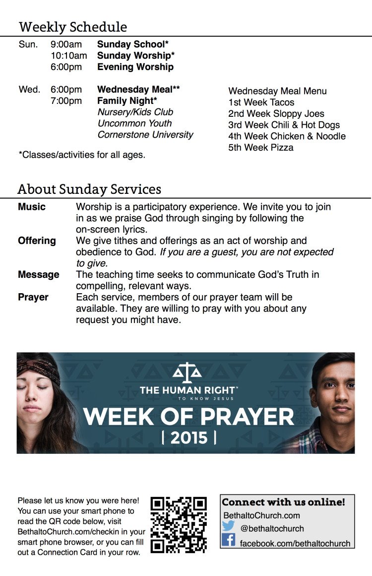
Inside Left
For as long as I can remember, we’ve always had a weekly schedule in our newsletters. However, this is first time we’ve streamlined it by removing all the offerings we have for each age group under each service. I don’t like leaving this valuable information out, but that’s what a website and a guest/welcome center is for.
The “About Sunday Services” section is my favorite. I would have never thought of it if I hadn’t seen this newsletter from Genesis in another blog post about bulletins. In fact, I straight up copy and pasted there section into our newsletter. I changed some of their wording and left a lot of the rest. I don’t like that, but I honestly couldn’t find better ways to say a lot of it. I’m hoping that, since this is a brand new design for my church, that I’ll be able to solicit some suggestions and corrections from others before the next month is printed. That aside, I absolutely love this section. Guests may have a basic understanding of church, and the may not. My church is very contemporary, evangelical, and pentecostal, and yet we’ve had a lot of folks come to our church who used to be Lutherans and Catholics. Without this section, I’m reasonably sure they would feel lost.
I included the “Week of Prayer” image for three reasons:
- I want this space to be where we include artwork from the one (or two) major event(s) going on this month;
- it helped tie in the message theme mentioned on the cover;
- and it helped to fill space without adding more text.
The bottom section includes our checkin QR code and some of our social media accounts. It’s not a section that gets a lot of attention because the demographics of our church are titled towards older individuals. I’d like to enlarge this section, but I already have Baby Boomers asking me why we have it at all. So, I guess I should just be thankful for what I’ve got and leave it for now.
This was a tough page to work on because I like to use large fonts with tons of line space, but my lead pastor—who has a better eye than I—liked reserving some white space between sections for the purpose of separation. I agree with that, but even still, I might give the “About Sunday” section a bit more space next month. Of course, next month, the event image might be taller, so that would take up some space as well.
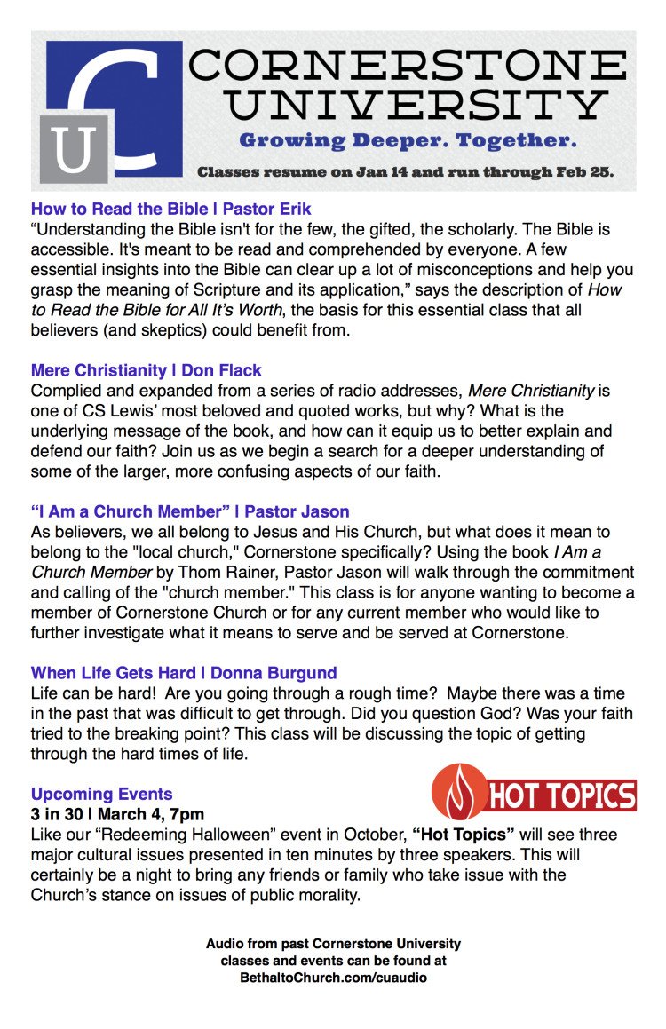
Inside Right
Cornerstone University is our Wednesday night programming for adults. It’s a relatively new system (in its second year) that replaced a decade old system, and it’s been fairly successful.* Prior to this redesign, we’d been printing out a page like this every few weeks to help folks find a class they’d like to attend for the next session. In discussing the redesign, our lead pastor decided that Cornerstone U is important to enough to have a permanent section in the newsletter, even though next month, when we print this again, the classes won’t be new anymore. Why? Because we value this program and want to make sure that it’s one of the first things our guests see.
Back Cover
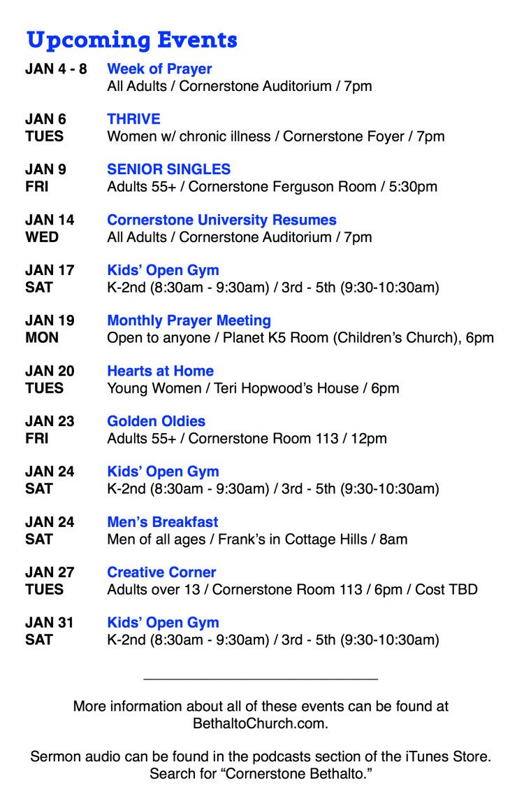
The back cover list of events is a hold-over from our last newsletter design, though the secondary line of event info is new. We added this because we removed all of the event descriptions we used to have on the inside of our old newsletter. This section does feel a bit too condensed, but I want to keep it like this for a while. This is a change that might need some time to evolve. We want events to be announced so that guests and regular attenders are informed, but we don’t want meandering paragraphs filling up the entire thing.
Anyway, that’s about it. I’m sure there are several aspects of this design that I have forgotten to properly explain, but that’s how it goes sometimes. If you have a question or suggestion, drop in it in the comments below.
If you’d like to use this newsletter as a template for your design, you can download it here (ZIP containing one Pages file, version 5.2.2. I haven’t updated to Yosemite yet). If you do download the file, please share this post on the social media platform of your choice, as a “thank you.”
*Full Disclosure: Cornerstone U is my baby, so take what I say with a grain of salt. 🙂
[Some design inspiration for our newsletter came from Genesis | HT I4J]
Phil Schneider
I'm a teacher and discipleship pastor. More importantly, I'm husband to the greatest woman in the world and father to a ridiculously cute daughter. I also occasionally scratch out a few blog posts.


Look Great
Thanks!